GPT Image 1.5 Prompting Guide: 50+ Prompts That Work
Raman Singh
Raman Singh is a highly skilled marketing professional who serves as the head of marketing at Copyrocket AI

GPT Image 1.5 Prompting Guide helps you get clean, consistent images faster. You control results with clear subject details, camera choices, lighting, style, and output specs. You also reduce retries by stating what you do not want. This guide gives you a simple prompt formula, editing workflows, and 50+ prompts you can copy and run.
Key Takeaways
- Use a prompt formula that names subject, scene, style, camera, lighting, and output specs.
- State constraints like aspect ratio, background, color palette, and text rules to cut revisions.
- Add negatives to block common issues like extra fingers, blurry text, and warped logos.
- Use edit prompts to change one thing at a time while you keep the rest the same.
- Build consistency with a style block, a brand kit block, and a repeatable naming scheme.
- Validate output with a quick checklist for anatomy, typography, edges, and compression.
What GPT Image 1.5 does best (and what you must specify)
GPT Image 1.5 can generate images from text prompts and can also edit images with instructions. Your prompt must name the goal and the output rules.
If you leave gaps, the model fills them with defaults. Defaults can break brand style, layout, or realism. Use this section to set the right level of detail.
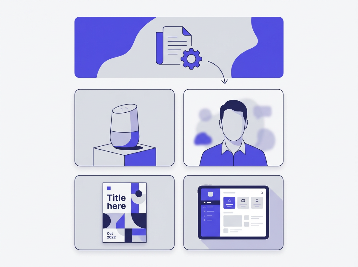
Best use cases
- Marketing creatives: ads, banners, social posts, thumbnails, hero images.
- Product visuals: packshots, lifestyle scenes, color variants, simple 3D looks.
- Illustration: icons, stickers, editorial art, children’s book pages.
- Concept art: environments, props, character sheets, mood boards.
- Image edits: background swaps, object removal, color changes, layout fixes.
Where prompts fail
- Vague subjects: “a nice photo” gives random styling.
- Missing constraints: no aspect ratio leads to wrong crop for your channel.
- Unclear text: small text can blur if you do not set typography rules.
- Too many goals: one prompt tries to do photo, logo, and poster at once.
Prompting mindset
- Write prompts like a creative brief.
- Give the model a single job per run.
- Lock what must not change.
- Change one variable per revision.
The core prompt formula you can reuse
This GPT Image 1.5 Prompting Guide uses one repeatable structure. You can paste it into any request and fill the blanks. It keeps your prompts short, clear, and consistent.
The 8-part prompt template
- 1) Goal: what you want to create or edit.
- 2) Subject: who or what is in the image.
- 3) Scene: location, background, props, time of day.
- 4) Composition: framing, angle, distance, layout.
- 5) Lighting: softbox, daylight, rim light, shadows.
- 6) Style: photo, 3D, vector, watercolor, anime, film still.
- 7) Output specs: aspect ratio, resolution, file type, safe margins.
- 8) Negatives: what to avoid.
Copy-ready template (text-to-image)
Prompt: Create a [type of image] of [subject] in [scene]. Use [composition]. Use [lighting]. Use [style]. Output: [aspect ratio], [resolution], [background rules], [color palette]. Avoid: [negatives].
Copy-ready template (image edit)
Prompt: Edit the provided image. Keep [elements to keep]. Change only [one change]. Match the original [lighting/color/grain/perspective]. Output: [aspect ratio], [format]. Avoid: [negatives].
Short style blocks you can append
- Clean product photo block: “studio photo, softbox key light, subtle shadow, neutral white background, sharp edges, realistic reflections”
- Modern vector block: “flat vector, clean strokes, geometric shapes, limited palette, no gradients, SVG-ready look”
- Film still block: “35mm film look, natural grain, shallow depth of field, cinematic color grade, realistic skin tones”
How to write prompts that give consistent results
Consistency comes from repeatable constraints. You must define the parts that matter for your brand or project. Then you reuse them in every prompt. This section shows the exact fields to lock.
Lock the “must stay” list
- Brand colors (HEX codes if you have them)
- Typography rules (font style, weight, case, tracking)
- Background rules (solid, gradient, texture, environment)
- Camera rules (lens, angle, depth of field)
- Lighting rules (soft, hard, direction, shadow strength)
Use a brand kit block
Paste this block at the end of every prompt when you need brand consistency.
- Brand kit: Primary color: [#HEX]. Secondary color: [#HEX]. Accent: [#HEX]. Background: [rule]. Mood: [3 adjectives]. Typography: [rule]. Logo use: [rule].
Use a layout block for marketing images
- Layout: headline area at top 20%, product centered, CTA button bottom right, 8% safe margin, no text near edges.
Use negatives that match your target
- For people: “avoid extra fingers, deformed hands, asymmetrical eyes, plastic skin, heavy blur”
- For logos: “avoid misspelled text, warped shapes, uneven stroke widths, random symbols”
- For product shots: “avoid dents, scratches, melted edges, wrong label text, odd reflections”
Prompting for different image types (with clear instructions)
Each image type needs different details. A product photo needs lighting and reflections. A poster needs layout and text rules. A vector icon needs stroke rules. Use the matching checklist and prompt pattern below.
Photorealistic images
- Name the subject and material (metal, glass, fabric).
- Name the lens and distance (35mm, 85mm, macro).
- Name the light source and direction.
- Name the environment and surface.
- Set realism rules: “realistic texture, natural shadows, no painterly look.”
Illustrations and editorial art
- Name the illustration medium (ink, gouache, vector).
- Name line weight and shading rules.
- Name palette size (2-color, 5-color).
- Name background detail level (blank, minimal, full scene).
Logos and icons
- State “simple, scalable, high contrast.”
- State “no small details, no thin lines.”
- State “centered on plain background.”
- State “deliver as clean vector look.”
Posters, ads, and thumbnails
- Define aspect ratio for the platform.
- Define text hierarchy (headline, subhead, CTA).
- Define safe margins and empty space.
- Define brand colors and contrast rules.
UI mockups and app screens
- Define device frame or no device frame.
- Define grid and spacing (8px system, 12-column).
- Define font style and icon set style.
- Define content rules (real words, no gibberish).
Editing images with GPT Image 1.5: reliable workflows
Edits work best when you keep most of the image fixed. You should tell the model what to preserve and what to change.
You should also request a match for lighting, perspective, and grain. Use these workflows to avoid “new image” drift.
Workflow 1: Change one thing
- Step 1: Say “Keep everything else the same.”
- Step 2: Name one change only (color, object, background).
- Step 3: Add “match original lighting and shadows.”
- Step 4: Add “match original camera angle and depth of field.”
Workflow 2: Remove an object cleanly
- Name the object to remove.
- Ask for background fill that matches texture and pattern.
- Ask to keep edges sharp and avoid smears.
Workflow 3: Replace background while keeping subject
- Say “Keep the subject unchanged.”
- Say “Keep original shadows direction.”
- Describe the new background with depth and blur rules.
Workflow 4: Add text without ruining layout
- Provide exact text in quotes.
- Specify font style and case rules.
- Specify size, placement, and safe margins.
- Ask for “crisp, readable text with clean edges.”
50+ copy-paste prompts for GPT Image 1.5
Use these prompts as starting points. Replace bracket fields with your details. Keep the structure. If you need variants, change one field at a time.
Product photography prompts (12)
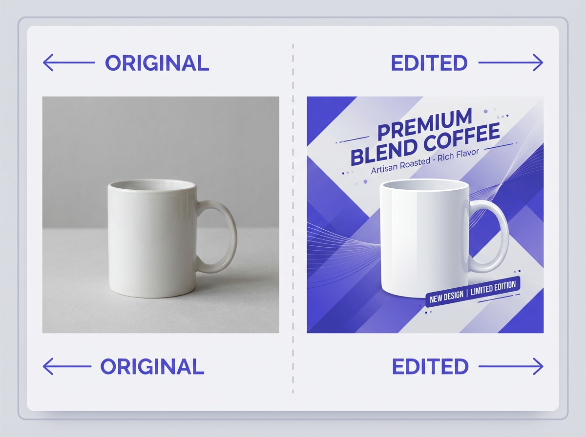
- Create a studio product photo of a [product] on a matte white surface. Use a 85mm lens look, eye-level angle, softbox key light from the left, gentle shadow. Style: photorealistic. Output: 1:1, 2048x2048, pure white background. Avoid: glare hotspots, warped labels, blurry edges.
- Create a premium product photo of a [glass bottle] with condensation droplets. Scene: dark slate surface, subtle backlight rim. Composition: centered, 3/4 angle. Output: 4:5, 2048x2560. Avoid: unreadable label text, fake reflections.
- Create a lifestyle photo of [product] in a modern kitchen. Morning window light, soft shadows. Composition: product in foreground, shallow depth of field. Output: 16:9, 2560x1440. Avoid: clutter, random brand marks.
- Create a macro photo of [product detail] showing texture. Use macro lens look, high sharpness, controlled highlights. Output: 3:2, 2400x1600. Avoid: noise, mushy texture.
- Create a flat lay photo of [skincare set] on beige linen fabric. Top-down view, soft diffused light, clean spacing. Output: 4:5. Avoid: overlapping items, harsh shadows.
- Create a product photo of [shoe] floating with a soft shadow beneath. Background: light gray gradient. Output: 1:1. Avoid: cutout edges, distorted proportions.
- Create a studio photo of [watch] with realistic metal reflections. Composition: 3/4 angle, focus on dial. Output: 4:5. Avoid: warped numerals, melted metal.
- Create a product photo of [coffee bag] standing upright. Background: pure white. Lighting: softbox front, fill light right. Output: 2:3. Avoid: unreadable small text, bent geometry.
- Create a product photo of [headphones] on a black acrylic surface with subtle reflection. Lighting: rim light, low-key. Output: 16:9. Avoid: crushed blacks, noisy shadows.
- Create a product photo of [perfume bottle] with light refraction and clean highlights. Background: soft pastel gradient. Output: 4:5. Avoid: cloudy glass, uneven label.
- Create a product photo of [laptop] open at 110 degrees, screen off, clean reflections. Background: light gray. Output: 16:10. Avoid: warped keyboard, strange ports.
- Create a studio photo of [ceramic mug] with a natural shadow and visible glaze texture. Output: 1:1. Avoid: warped handle, uneven rim.
Brand and marketing prompts (12)
- Create a Facebook ad image for [product]. Layout: product left, headline right, CTA button bottom right, 8% safe margins. Colors: [brand HEX]. Output: 1.91:1, 1200x628. Text: “[#headline]” and “[#cta]”. Avoid: tiny text, clutter.
- Create an Instagram Story promo for [event]. Background: bold gradient using [HEX]. Layout: big headline top, date center, CTA bottom. Output: 9:16, 1080x1920. Avoid: low contrast text.
- Create a YouTube thumbnail for “[video topic]”. Subject: expressive [person] on left. Big text on right: “[3–5 word hook]”. High contrast, clean outline around subject. Output: 16:9, 1280x720. Avoid: blurry text, busy background.
- Create a hero banner for a website about [service]. Scene: minimal, modern. Layout: empty space on left for headline. Output: 21:9, 2560x1080. Avoid: distracting details.
- Create a LinkedIn post image about [topic]. Style: clean editorial, simple icons, short headline. Output: 1:1, 1200x1200. Avoid: long paragraphs.
- Create a sale banner with text “SALE 30% OFF” and “This week only”. Style: modern, bold typography, simple shapes. Output: 4:1, 2000x500. Avoid: warped letters.
- Create a product comparison graphic. Layout: two columns, “Plan A” vs “Plan B”, simple check icons. Style: flat vector. Output: 16:9. Avoid: tiny labels.
- Create a holiday promo image for [brand]. Scene: subtle seasonal elements, clean background. Layout: headline top, product center, CTA bottom. Output: 4:5. Avoid: heavy clutter.
- Create a testimonial card image. Text: ““[quote]”” and “— [name], [role]”. Style: minimal, soft shadow card. Output: 1:1. Avoid: low readability.
- Create a podcast cover for “[show name]”. Style: bold, simple portrait illustration, high contrast. Output: 1:1, 3000x3000. Avoid: tiny text.
- Create a conference slide cover. Text: “[talk title]” and “[speaker name]”. Style: clean, big typography, abstract background shapes. Output: 16:9. Avoid: noisy patterns.
- Create a pricing table header image. Style: minimal vector, brand colors, lots of whitespace. Output: 16:9. Avoid: detailed scenes.
Illustration and icon prompts (10)
- Create a flat vector icon of a [concept]. Use a 2px stroke, rounded corners, two-color palette: [HEX1] and [HEX2]. Output: 1:1. Avoid: gradients, tiny details.
- Create a set of 6 matching icons for: [list]. Style: flat vector, consistent stroke and corner radius. Output: 2048x2048 sprite sheet. Avoid: mixed styles.
- Create an editorial illustration of [topic]. Style: ink linework with limited color fills, off-white paper texture. Output: 4:5. Avoid: photorealism.
- Create a children’s book illustration of [scene]. Style: watercolor, soft edges, warm palette, simple faces. Output: 3:2. Avoid: scary mood.
- Create a sticker-style illustration of [character]. Thick outline, bright colors, simple shading. Output: 1:1 with transparent background look. Avoid: thin lines.
- Create an isometric illustration of a [room]. Clean geometry, soft shadows, minimal clutter. Output: 16:9. Avoid: warped perspective.
- Create a monochrome line icon of [object]. Black on white, consistent line weight, centered. Output: 1:1. Avoid: shading.
- Create a retro poster illustration of [theme]. Style: 1970s screen print, limited palette, halftone texture. Output: 2:3. Avoid: modern gradients.
- Create a technical diagram illustration of [process]. Clean labels, arrows, simple shapes. Output: 16:9. Avoid: decorative elements.
- Create a mascot illustration of a [animal] for a tech brand. Style: simple vector, friendly expression, brand colors. Output: 1:1. Avoid: sharp teeth, scary eyes.
Portrait and character prompts (8)
- Create a professional headshot of a [person description]. Background: neutral gray. Lighting: soft key light, subtle rim. Composition: shoulders up, centered. Output: 4:5. Avoid: plastic skin, odd teeth.
- Create a cinematic portrait of a [character] at night in city rain. Lighting: neon rim light, wet reflections. Style: film still, natural grain. Output: 16:9. Avoid: smeared face details.
- Create a character turnaround sheet for a [character]. Show front, side, back views. Clean white background. Style: concept art, crisp lines. Output: 16:9. Avoid: inconsistent outfit details.
- Create a fantasy character portrait of a [character]. Style: painterly but with sharp facial features. Output: 4:5. Avoid: extra limbs, asymmetrical eyes.
- Create a street photo portrait of a [person] in golden hour. 50mm lens look, shallow depth of field. Output: 3:2. Avoid: heavy blur, strange hands.
- Create a corporate team photo style image of [number] people. Scene: modern office. Lighting: soft, even. Output: 16:9. Avoid: duplicated faces, odd hands.
- Create an avatar image for a SaaS app. Style: clean 3D, soft lighting, simple background. Output: 1:1. Avoid: uncanny skin texture.
- Create a passport-style photo of a [person]. Plain background, even lighting, neutral expression. Output: 35x45mm ratio look. Avoid: shadows on face.
Text and typography prompts (6)
- Create a typographic poster with the text “MAKE IT SIMPLE”. Style: Swiss design, grid layout, black and white, one accent color [HEX]. Output: 2:3. Avoid: warped letters, uneven spacing.
- Create a quote card. Text: ““[quote]””. Font: bold sans-serif, all caps. Background: solid [HEX]. Output: 1:1. Avoid: low contrast.
- Create a product label mockup for “[brand name]” “[product name]”. Style: clean minimal, high readability. Output: 4:5. Avoid: misspellings, random symbols.
- Create a book cover with title “[#title]” and author “[#author]”. Style: minimal, strong focal image, clear hierarchy. Output: 2:3. Avoid: tiny text.
- Create a menu header graphic with text “COFFEE MENU”. Style: modern, simple icons, clean spacing. Output: 16:9. Avoid: decorative scripts.
- Create a banner with the text “NEW ARRIVAL”. Style: bold, centered, lots of whitespace. Output: 4:1. Avoid: blurry edges.
Image editing prompts (8)
- Edit the provided image. Remove the person in the background on the left. Keep everything else the same. Match the wall texture and lighting. Avoid: smears, repeated patterns.
- Edit the provided image. Change the shirt color to [color]. Keep the face, pose, and background unchanged. Match original shadows. Avoid: color spill on skin.
- Edit the provided image. Replace the background with a clean white studio background. Keep the subject edges sharp. Add a soft ground shadow. Avoid: halo edges.
- Edit the provided image. Add the text “FREE SHIPPING” at the top center in bold sans-serif. Keep 8% safe margins. Avoid: warped letters.
- Edit the provided image. Remove glare from the product label while keeping label text readable. Avoid: blur, loss of detail.
- Edit the provided image. Extend the canvas to the right to create space for text. Continue the background naturally. Output: 16:9. Avoid: seams.
- Edit the provided image. Replace the sky with a clear sunset sky. Keep buildings unchanged. Match color temperature and reflections. Avoid: fake edges.
- Edit the provided image. Remove the logo from the hat and replace it with a blank fabric texture. Keep stitching detail. Avoid: melted fabric.
Advanced prompt controls: composition, camera, lighting, and color
Small wording changes can change the full result. Use these controls to steer output with fewer retries. Keep your language direct. Use numbers when you can.
Composition controls that work
- Framing: close-up, medium shot, wide shot, full body, head-and-shoulders.
- Angle: eye-level, top-down, low angle, 3/4 view.
- Layout: centered, rule of thirds, negative space on left/right.
- Depth of field: shallow, medium, deep focus.
Camera and lens cues
- 24mm: wide scene, more environment.
- 35mm: natural documentary look.
- 50mm: balanced, classic perspective.
- 85mm: portrait compression, soft background.
- Macro: texture and small details.
Lighting cues
- Softbox: soft shadows, clean product look.
- Window light: natural mood, gentle contrast.
- Rim light: edge separation, premium feel.
- Low-key: dark mood, controlled highlights.
Color controls
- State palette size: “3-color palette” or “monochrome.”
- State temperature: “warm” or “cool.”
- State contrast: “high contrast” or “soft contrast.”
- State exact colors: “use #0B1F3B and #F2C14E.”
Common mistakes and quick fixes
Most failures come from missing constraints or mixed goals. Use these fixes to get back to clean output fast.
Mistake: The image looks random across runs
- Fix: reuse a style block and a brand kit block.
- Fix: keep camera and lighting constant.
Mistake: Hands and faces look wrong
- Fix: reduce motion, reduce crowd size, use simpler poses.
- Fix: add negatives: “avoid extra fingers, avoid distorted hands.”
Mistake: Text is unreadable
- Fix: use fewer words and larger font size rules.
- Fix: ask for “crisp, high-contrast text.”
- Fix: add text in a second edit step.
Mistake: The product label changes
- Fix: say “do not change label text or logo.”
- Fix: edit the image instead of regenerating it.
Mistake: The background looks fake
- Fix: name a real surface and light direction.
- Fix: add “natural shadows” and “realistic reflections.”
Quality checklist before you publish
Run this checklist on every output. It prevents small errors that reduce trust. It also saves time in review cycles.
Visual quality
- Edges look clean with no halos.
- Shadows match the light direction.
- Materials look correct (glass, metal, fabric).
- No strange duplicates or repeated patterns.
People and anatomy
- Hands have correct finger count and shape.
- Eyes align and look in the same direction.
- Skin texture looks natural for the style.
Brand and layout
- Colors match brand HEX values.
- Typography is readable on mobile.
- Safe margins are respected.
- Logo placement follows your rules.
Export rules
- Correct aspect ratio for the channel.
- Resolution matches your use case.
- Compression does not blur text.
Frequently Asked Questions (FAQs)
What is the best prompt length for GPT Image 1.5?
Use the shortest prompt that still names subject, scene, style, lighting, and output specs. Add negatives only for issues you see often.
How do I get consistent brand style across many images?
Reuse a brand kit block with colors, typography rules, and layout rules. Keep camera and lighting cues the same across prompts.
How do I add readable text to images?
Provide the exact text in quotes and set font style, placement, and contrast rules. If text still fails, generate the image first and add text in an edit step.
Should I generate a new image or edit an existing one?
Use editing when you must keep the subject, label, or layout. Use new generation when you need a new concept or scene.
What negatives should I use most often?
Start with: “avoid blurry text, avoid warped logos, avoid extra fingers, avoid deformed hands, avoid low resolution, avoid heavy blur.” Then adjust by project type.
How do I reduce the number of retries?
State aspect ratio, layout, and what must not change. Then revise one variable at a time instead of rewriting the full prompt.
Final Thoughts
This GPT Image 1.5 Prompting Guide gives you a simple formula, proven constraints, and 50+ prompts you can reuse for real work. Start with one clear goal, lock your brand rules, and add negatives that block common errors. If you want faster results, pick one prompt from the list, run it, then do one edit change per step. Now copy a template, fill the brackets, and generate your next image set with fewer retries.
Frequently Asked Questions

Written by
Raman Singh
Raman Singh is a highly skilled marketing professional who serves as the head of marketing at Copyrocket AI. With years of experience in the field, Raman has developed a deep understanding of all asp
View all postsYour AI Marketing Agents
Are Ready to Work
Stop spending hours on copywriting. Let AI craft high-converting ads, emails, blog posts & social media content in seconds.
Start Creating for FreeNo credit card required. 50+ AI tools included.
Related Articles
 General
NotebookLM For Coders: Turn Docs Into Faster Code
Code work often fails for a simple reason. You do not have the right context at the right time. You read docs in one tab, skim tickets in another tab, and then...
 General
How to Optimize for AI Search in 2026: The Complete Guide
AI search has shifted from experimental feature to primary search method for millions of users. ChatGPT Search, Google AI Overviews, Perplexity, Claude, and Gem...
 General
Claude Opus 4.6 Review: Here's What New!
Claude Opus 4.6 from Anthropic draws attention because teams want an AI model that writes better code, follows instructions, and stays consistent across long se...