How to Create Infographics in NotebookLM (Best Practices)
Raman Singh
Raman Singh is a highly skilled marketing professional who serves as the head of marketing at Copyrocket AI

Infographics help people learn fast. They turn long notes into clear visuals. NotebookLM can help you draft infographic copy, structure, and layout ideas from your sources.
You still need to guide the output with clear prompts, strong design rules, and a simple review process. This guide shows how to create infographics in Notebooklm (best practices) with steps you can repeat for any topic.
Key Takeaways
- NotebookLM can create infographic drafts from your uploaded sources using the Studio Infographic option and guided prompts.
- Start with one goal and one audience so the infographic stays focused and readable.
- Use a fixed layout plan (header, 3–6 sections, footer) to reduce clutter and improve flow.
- Control style with a design brief that defines colors, fonts, spacing, and icon rules.
- Validate every claim by checking it against your sources and adding citations or footnotes.
- Export and test for mobile readability, accessibility, and social sharing before you publish.
What NotebookLM can do for infographic creation
NotebookLM works best when you treat it as a drafting and structuring tool. It can read your sources, pull key points, and propose a visual outline. It can also write short labels, captions, and data callouts that fit inside a design. You get the best results when you provide clean inputs and clear constraints.
Can NotebookLM create infographics?
Yes. NotebookLM can generate an infographic draft from your sources. In many setups, you use the Studio panel and select Infographic. NotebookLM then proposes sections, headings, and short copy.
You can refine the draft with prompts and edits. You can also use the pencil or edit controls to adjust text and structure before you export or rebuild the design in a dedicated tool.
What NotebookLM does well (and where you still need control)
- Good at: summarizing sources, extracting key points, proposing section order, writing short labels, generating title options, and suggesting chart types.
- Needs your control: final data accuracy, brand styling, exact chart values, accessibility checks, and final export quality.
- Best workflow: use NotebookLM for outline + copy + layout notes, then finalize visuals in a design tool if you need strict brand control.
What to prepare before you open Studio
- 1 topic statement: “Explain X in 60 seconds.”
- 1 audience statement: “For new users,” “for managers,” or “for students.”
- 3–7 source files: PDFs, docs, web pages, or notes that contain the facts you will show.
- 1 success metric: “More sign-ups,” “more shares,” or “fewer support tickets.”
Best way to create an infographic in NotebookLM
The best method uses a short planning step, a strict prompt, and a review loop. You should decide the story first. Then you should force the draft into a simple layout. This approach keeps the infographic clear and reduces edits later.
Use a simple infographic goal formula
- Audience: Who will read it?
- Problem: What question do they have?
- Promise: What will they learn?
- Proof: What data or sources support it?
- Action: What should they do next?
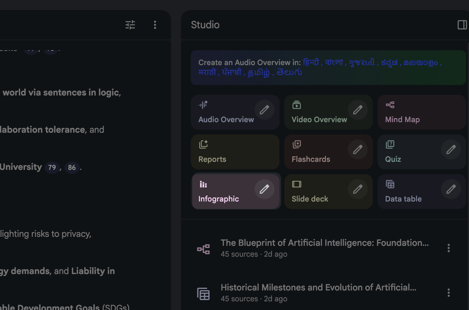
Open Studio and start an Infographic draft
- Upload or select your sources in the notebook.
- Open Studio.
- Select Infographic.
- Choose a draft style if NotebookLM offers options (for example: checklist, timeline, comparison, or stats).
- Generate the first version.
Give NotebookLM a design brief that controls style
Competitor posts that rank well focus on style control. You should do the same. Put these rules in your prompt so NotebookLM writes copy that fits the design.
Click on pencil icon on Infographics to edit your preferences before output.
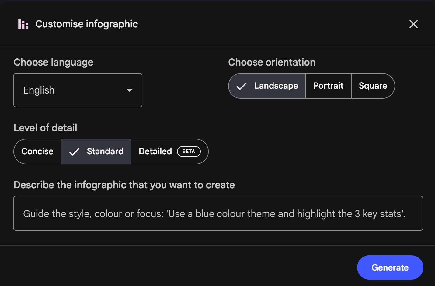
- Language: Pick your desired language as NotebookLM has many.
- Orientation: Potrait for Stories, sqaure for Instagram feed, landscape for LinkedIn.
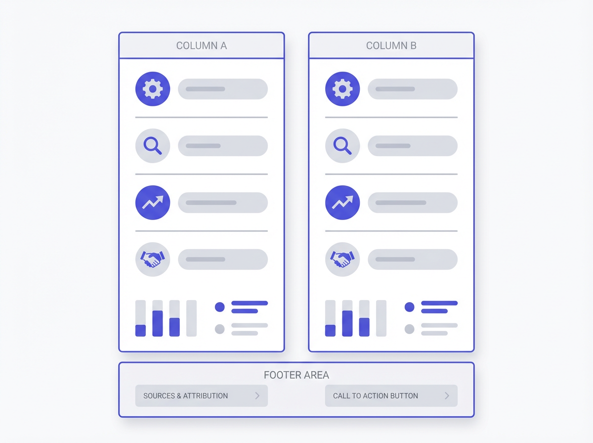
- Layout: header, 4–6 blocks, footer with sources and CTA.
- Color palette: 2 primary colors + 1 accent + neutral background. Example: navy (#0B1F3B), teal (#12B5A6), accent yellow (#F5C542), background off-white (#F7F7F7).
- Fonts: 1 headline font + 1 body font. Example: Headline: Inter Bold; Body: Inter Regular.
- Spacing: 24–32 px padding around blocks; consistent margins.
- Icon style: flat line icons, same stroke width, no mixed styles.
- Vibe: clean, modern, high contrast, no clutter.
- Copy limits: title ≤ 8 words, section headers ≤ 5 words, bullets ≤ 10 words each.
Prompt template you can reuse inside describe
Paste this prompt into NotebookLM after you generate a first draft, or use it to generate the draft if your setup allows.
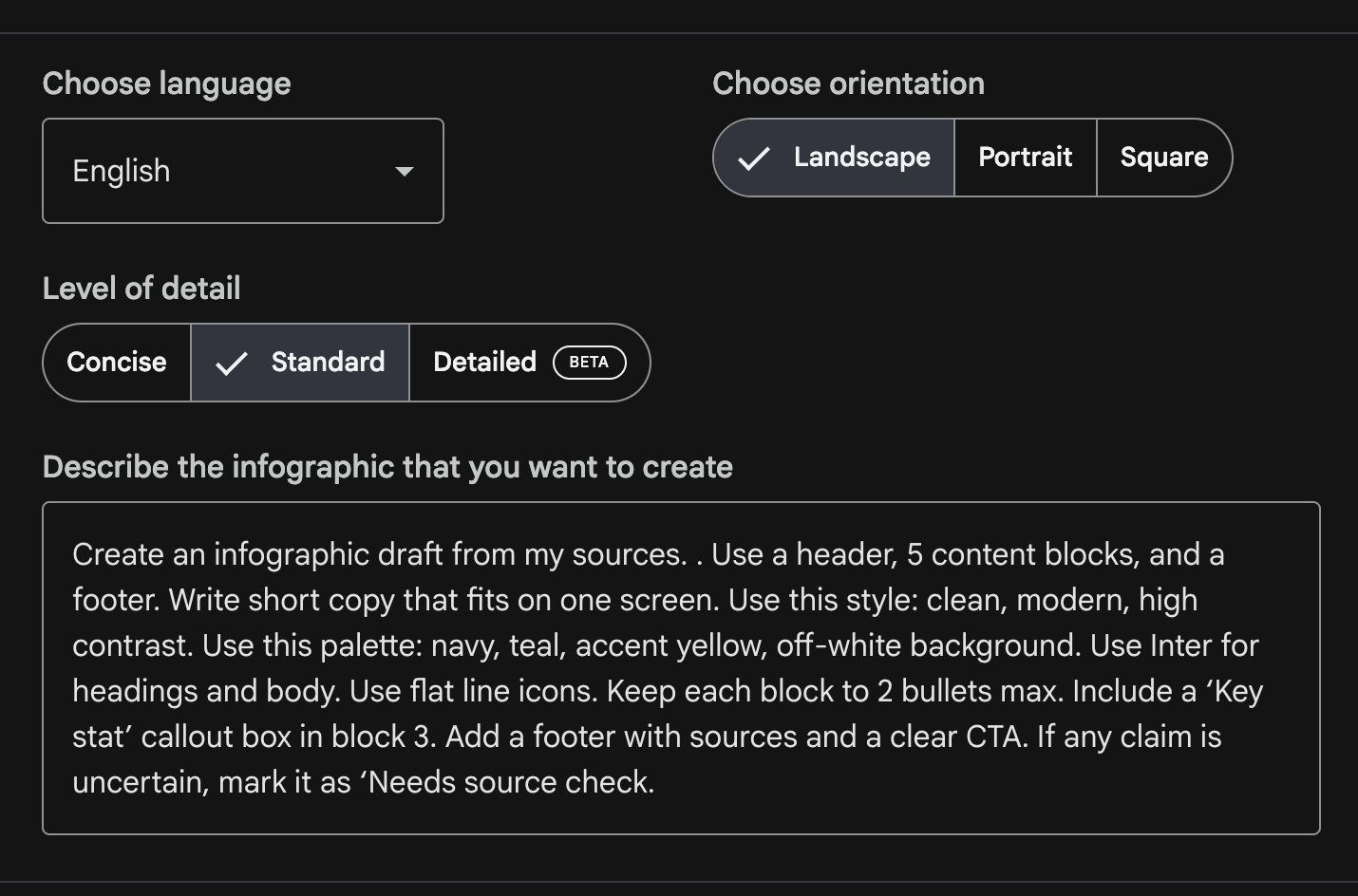
- Prompt: “Create an infographic draft from my sources. . Use a header, 5 content blocks, and a footer. Write short copy that fits on one screen. Use this style: clean, modern, high contrast. Use this palette: navy, teal, accent yellow, off-white background. Use Inter for headings and body. Use flat line icons. Keep each block to 2 bullets max. Include a ‘Key stat’ callout box in block 3. Add a footer with sources and a clear CTA. If any claim is uncertain, mark it as ‘Needs source check.’”
Pick the right infographic type for the message
- Process: best for “how-to” and steps.
- Comparison: best for “A vs B” decisions.
- Timeline: best for history or rollout plans.
- Checklist: best for audits and best practices.
- Stats: best for reports and surveys.
- Framework: best for 3–7 pillar models.
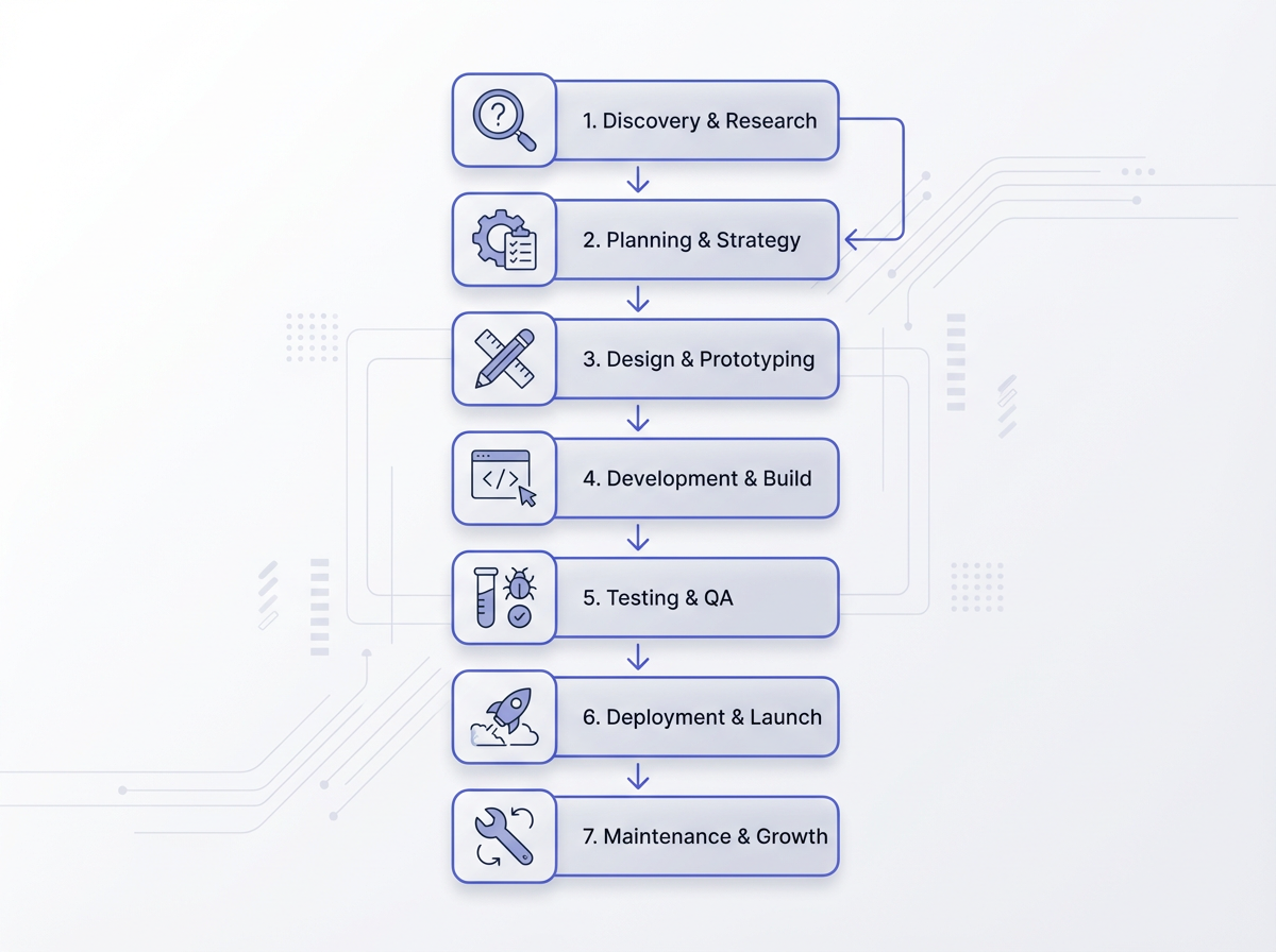
The 7 steps in creating an infographic (NotebookLM workflow)
You can use the same seven steps for most topics. Each step has a clear output. This helps you move from sources to a final visual without guessing.
Step 1: Define one message and one action
- Write one sentence that states the main point.
- Write one sentence that states the reader action.
- Reject extra topics that do not support the main point.
Step 2: Load sources and label them
- Add PDFs, notes, docs, or web sources that contain the facts.
- Rename sources with clear labels like “Survey-2025,” “Internal-Guide,” or “Case-Study.”
- Remove sources that repeat the same information.
Step 3: Ask NotebookLM for a structured outline
- Request 4–6 sections with short headers.
- Request 1 key stat and 1 example per section if available.
- Request a short footer CTA.
Step 4: Convert the outline into “infographic copy”
- Tell NotebookLM to rewrite all text to fit a visual layout.
- Set strict length limits for titles, headers, and bullets.
- Ask for parallel wording across bullets (same grammar pattern).
Step 5: Add layout instructions (so the design stays clean)
- Specify a grid: single column or two column.
- Specify where charts go: top, middle, or bottom.
- Specify callout styles: “boxed stat,” “highlight bar,” or “badge.”
Step 6: Verify facts and add citations
- Check each number against a source.
- Remove claims that lack support.
- Add a source line in the footer.
- Keep citations short: “Source: Report Name, Year.”
Step 7: Export, test, and publish
- Test readability on a phone screen.
- Check contrast for text and background.
- Export in the right size for your channel.
- Publish with alt text and a short caption.
The 5 elements of an infographic (and how to build them in NotebookLM)
Every strong infographic uses the same core parts. If you build these five elements on purpose, you avoid clutter and confusion. NotebookLM helps you draft each element fast, but you must set limits and review the output.
Element 1: A clear headline
- Use 6–10 words.
- Use a specific promise: “7 Steps to X” or “X Checklist.”
- Avoid vague titles like “Everything about X.”
Element 2: A simple story flow
- Use a start, middle, and end.
- Start with the problem or a key stat.
- End with a summary and CTA.
Element 3: Data or proof
- Use 1–3 key numbers, not 20 numbers.
- Use labels that explain the number in plain words.
- Include a source line in the footer.
Element 4: Visual structure (layout, icons, and charts)
- Use consistent spacing and alignment.
- Use one icon style and one chart style.
- Use color to group related items.
Element 5: A call to action
- Use one action verb: “Download,” “Try,” “Share,” or “Learn.”
- Place it in the footer with a short link or QR code (if needed).
- Match the CTA to the audience goal.
NotebookLM infographic best practices that improve quality
These best practices help you get cleaner drafts and better final visuals. They also reduce rework. Use them as a checklist each time you create an infographic.
Use fewer sections than you think you need
- Use 4–6 blocks for a single-screen infographic.
- Use 6–9 blocks for a long vertical infographic.
- Remove any block that repeats the same idea.
Write for scanning, not reading
- Use short headers that state the point.
- Use bullets with one idea each.
- Use numbers and labels that stand alone.
Control tone and wording with strict rules
- Ask for active voice.
- Ask for subject-verb-object sentences.
- Ask for consistent verbs across lists (for example: “Define, Draft, Verify, Export”).
Design rules that keep the infographic readable
- Hierarchy: one title, then section headers, then bullets.
- Contrast: dark text on light background or the reverse, but stay consistent.
- Font sizes: title 48–72, headers 28–36, body 20–24 for mobile-first designs.
- Line length: keep bullets to 1 line when possible.
- Whitespace: add space between blocks so the eye can rest.
Color, layout, fonts, feel, and vibe (a practical spec)
- Colors: pick 2 main colors and 1 accent. Use the accent only for key stats and the CTA.
- Layout: use a single column for mobile. Use a two column grid only when you have short labels.
- Fonts: use one font family with two weights. Avoid mixing many fonts.
- Feel: use clean shapes, simple icons, and clear chart labels.
- Vibe: match the audience. Use playful colors for casual audiences. Use muted colors for business audiences.
Make NotebookLM output easier to design
- Ask for “copy blocks” that map to sections.
- Ask for “icon suggestions” per block.
- Ask for “chart suggestions” per stat (bar, donut, line).
- Ask for “final word count per block” so you can spot long sections.
Use a quality check before you export
- Accuracy check: every number matches a source.
- Clarity check: every header states a point.
- Consistency check: same tense, same bullet style, same units.
- Scan test: you understand it in 10 seconds.
- Mobile test: body text stays readable on a phone.
Prompt packs you can paste into NotebookLM
These prompt packs help you create better infographic drafts. Each one forces structure, limits length, and includes style rules. You can reuse them across topics.
Prompt pack 1: One-screen checklist infographic
- Prompt: “Create a one-screen checklist infographic from my sources. Write a title (max 8 words). Create 5 checklist items. Each item must use an action verb and max 9 words. Add a short ‘Common mistake’ line at the end (max 12 words). Add a footer with ‘Source: …’ and a CTA: ‘Save this checklist.’ Use clean, modern style. Suggest 1 icon per checklist item.”
Prompt pack 2: Stats infographic with one key chart
- Prompt: “Create a stats infographic draft from my sources. Include 1 hero stat at the top with a short label. Include 3 supporting stats in the middle. Include 1 suggested chart type for the supporting stats. Keep each label under 10 words. Add a footer with sources and a CTA: ‘Read the full report.’ Mark any stat that needs verification.”
Prompt pack 3: Process infographic (7 steps)
- Prompt: “Create a process infographic with 7 steps based on my sources. Use a vertical layout. Each step must have: a 2–4 word step name, a 7–12 word description, and an icon suggestion. Keep wording in active voice. Add a footer with sources and a CTA: ‘Use this workflow today.’”
Prompt pack 4: Comparison infographic (A vs B)
- Prompt: “Create a comparison infographic: Option A vs Option B. Use a two-column layout. Include 5 rows: best for, pros, cons, cost factors, time to value. Keep each cell under 12 words. Add a short recommendation rule at the bottom: ‘Choose A if…, Choose B if…’ Use neutral tone and clear labels.”
Common mistakes to avoid in NotebookLM infographics
Most infographic failures come from the same issues. You can avoid them with simple rules and a short review step.
Too much text
- Fix: set copy limits in the prompt.
- Fix: use 2 bullets per block max.
- Fix: move details to a blog post caption or a linked page.
Weak structure
- Fix: force a header, blocks, and footer layout.
- Fix: use numbered steps or grouped sections.
- Fix: add a “summary block” near the end.
Unclear data labels
- Fix: add units (%, $, hours) to every number.
- Fix: add a plain label that explains what the number means.
- Fix: avoid charts without a clear takeaway.
Style drift (mixed fonts, random icons, random colors)
- Fix: define a palette and font pair in the prompt.
- Fix: use one icon set style.
- Fix: use the accent color only for highlights.
Missing sources
- Fix: add a footer line for sources every time.
- Fix: keep a short citation format.
- Fix: remove claims you cannot support.
Publishing and SEO tips for infographic posts
You can improve search performance when you publish the infographic with clean on-page SEO. You should also make the image easy to index and easy to share.
On-page SEO checklist for an infographic page
- Use the primary keyword in the title and first paragraph: How to create infographics in Notebooklm (best practices).
- Use a short URL that includes “notebooklm-infographic.”
- Add an H2 that matches search intent, like “7 steps” or “best way.”
- Write a short intro that states the benefit in plain words.
- Add FAQs that answer direct questions.
Image SEO and accessibility
- Use descriptive file names: notebooklm-infographic-7-steps.png.
- Add alt text that describes the content in one sentence.
- Keep text large enough for mobile readers.
- Use high contrast for readability.
Distribution tips that increase reach
- Post a cropped “hero stat” as a teaser.
- Post the full infographic as a carousel or story sequence if it is long.
- Include a short caption that repeats the main takeaway.
- Ask for one action: “Save,” “Share,” or “Comment.”
Frequently Asked Questions (FAQs)
Can NotebookLM create infographics?
Yes. NotebookLM can generate an infographic draft from your sources, often through the Studio Infographic option. You should still review facts, style, and final layout.
What is the best way to create an infographic?
The best way uses one clear goal, a simple layout, strict copy limits, and a source check. In NotebookLM, start with a structured outline, then rewrite it as short visual copy.
What are the 7 steps in creating an infographic?
Define the message, load sources, draft an outline, rewrite as infographic copy, add layout rules, verify facts with sources, then export and test for mobile.
What are the 5 elements of an infographic?
A clear headline, a simple story flow, data or proof, visual structure, and a call to action.
How do I choose colors and fonts for a NotebookLM infographic?
Pick two main colors and one accent color. Use one font family with two weights. Keep contrast high and use the accent color only for highlights and the CTA.
How do I keep NotebookLM infographic text short?
Set limits in your prompt. Use a title under 8 words, headers under 5 words, and bullets under 10 words. Ask NotebookLM to rewrite until each block fits the limits.
Final Thoughts
NotebookLM can speed up infographic creation because it turns your sources into a clear outline and short visual copy. You get the best results when you set a simple goal, use a fixed layout, control style with a design brief, and verify every claim. Use the prompt templates in this guide, publish with strong image SEO, and test on mobile before you share. If you want faster output, create one reusable “infographic brief” prompt and use it for every new topic.
Call to action: Open NotebookLM, select one source set, and generate one infographic draft today. Then refine it with the checklist and prompts above.
Frequently Asked Questions

Written by
Raman Singh
Raman Singh is a highly skilled marketing professional who serves as the head of marketing at Copyrocket AI. With years of experience in the field, Raman has developed a deep understanding of all asp
View all postsYour AI Marketing Agents
Are Ready to Work
Stop spending hours on copywriting. Let AI craft high-converting ads, emails, blog posts & social media content in seconds.
Start Creating for FreeNo credit card required. 50+ AI tools included.
Related Articles
 General
NotebookLM For Coders: Turn Docs Into Faster Code
Code work often fails for a simple reason. You do not have the right context at the right time. You read docs in one tab, skim tickets in another tab, and then...
 General
How to Optimize for AI Search in 2026: The Complete Guide
AI search has shifted from experimental feature to primary search method for millions of users. ChatGPT Search, Google AI Overviews, Perplexity, Claude, and Gem...
 General
Claude Opus 4.6 Review: Here's What New!
Claude Opus 4.6 from Anthropic draws attention because teams want an AI model that writes better code, follows instructions, and stays consistent across long se...