
20 Nano Banana Pro Prompts for Business Infographics

Raman Singh
Raman Singh is a highly skilled marketing professional who serves as the head of marketing at Copyrocket AI
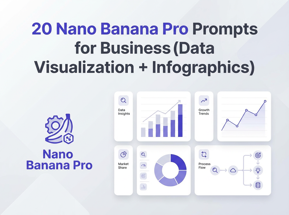
20 Nano Banana Pro Prompts for Business (Data visualization, Infographics): Use these copy-paste prompts to turn raw business data into clear charts, clean infographics, and board-ready visuals.
Each prompt tells Nano Banana Pro what to show, what to label, what style to use, and what file specs to export. You get faster reporting, better decision support, and fewer design revisions.
Checkout our AI Prompt generators;
Key Takeaways
- Use a fixed prompt structure so Nano Banana Pro outputs consistent charts and infographic layouts.
- Start with the business question (growth, churn, CAC, pipeline, cash) before you pick a chart type.
- Define data fields and units to prevent wrong scales, wrong totals, and wrong labels.
- Set brand rules (colors, fonts, spacing, tone) so every visual matches your company style.
- Request accessibility (contrast, color-blind safe palette, readable labels) for better comprehension.
- Export with specs (SVG/PNG/PDF, sizes, margins) so the asset fits slides, web, and print.
In this guide, you will get 20 Nano Banana Pro prompts you can copy and paste for business data visualization and infographics. For best results, you should insert your real numbers, keep field names consistent, and state the output format. Each section includes instructions you can reuse across teams.
How to use Nano Banana Pro for business visuals
You will get better outputs when you give Nano Banana Pro a clear goal, clean inputs, and strict layout rules. Use the instructions below before you paste any prompt.
Use this simple prompt template (copy-paste)
- Goal: State the decision the visual supports.
- Audience: State who will read it (CEO, sales team, customers).
- Data: Paste a table or list with field names and units.
- Chart type: Specify one primary chart and one optional secondary chart.
- Design: Specify brand colors, fonts, and spacing rules.
- Labels: Specify title, axis labels, legend labels, and callouts.
- Output: Specify SVG/PNG/PDF and exact dimensions.
Data rules that prevent bad charts
- Use one date format (example: 2026-01).
- Use one currency format (example: USD, no mixed symbols).
- State if values are totals, averages, or medians.
- State the time zone for time series data.
- State if missing values exist and how to treat them.
Brand rules you should always include
- Primary color: #0B5FFF
- Secondary color: #00C2A8
- Neutral: #111827, #6B7280, #E5E7EB
- Font: Inter (or a close web-safe fallback)
- Style: flat icons, no 3D, no heavy shadows
- Accessibility: color-blind safe palette, high contrast labels
20 Nano Banana Pro prompts for business data visualization and infographics
Use the prompts below as a library. Replace the bracketed parts with your data. If you do not have data ready, you can ask Nano Banana Pro to generate a sample dataset with the same fields, then swap in your real data later.
How to use these prompts?
To use these prompts,
- Go to gemini.google.com and paste below prompts
- Then replace everything in brackets with your own data
1) Executive KPI dashboard (one-page)
Use this when: You need a single slide that shows business health.
Act as a business data visualization designer.
Goal: Create a one-page executive KPI dashboard for a weekly leadership review.
Audience: CEO and department heads.
Data (table):
[PASTE KPI TABLE WITH FIELDS: metric, current_value, previous_value, target_value, unit, period]
Required KPIs: Revenue, Gross Margin %, Net Revenue Retention, CAC, LTV, Churn %, Pipeline $, Cash on Hand.
Layout: 8 KPI cards at top (2 rows), trend sparklines inside each card, then 2 charts below.
Charts: (1) Revenue by week (line). (2) Pipeline by stage (stacked bar).
Design: Brand colors [PRIMARY HEX], [SECONDARY HEX], neutrals. Font Inter. Flat style.
Labels: Show delta vs previous period and vs target. Use short labels.
Accessibility: High contrast, color-blind safe.
Output: SVG and PNG, 1920x1080, 24px margins.
Return: Final SVG markup plus a short legend note.
2) Revenue growth story (before/after + drivers)
Use this when: You need to explain why revenue changed.
Act as a business infographic designer.
Goal: Explain revenue change from [START PERIOD] to [END PERIOD] with clear drivers.
Audience: Board members.
Data:
Start revenue: [VALUE]
End revenue: [VALUE]
Drivers (table): [PASTE: driver, impact_value, positive_or_negative]
Visual: Waterfall chart with callouts for top 3 drivers.
Add: A small box that defines each driver in 8 words max.
Design: Clean, minimal, flat icons for each driver.
Output: PDF for print (A4) and PNG (1600x2000).
Return: Export-ready assets and a 40-word caption.
3) Sales pipeline funnel infographic
Use this when: You want a fast view of conversion and leakage.
Create a sales pipeline funnel infographic.
Goal: Show stage-to-stage conversion and drop-off.
Data (table): [PASTE: stage, leads_count, conversion_rate, avg_days_in_stage]
Rules: Sort stages in funnel order. Highlight the biggest drop-off in red.
Add: 3 callouts: biggest drop-off, slowest stage, fastest stage.
Design: Brand colors, flat icons, no gradients.
Output: PNG 1080x1350 and SVG.
Return: The infographic plus a short list of insights (max 5 bullets).
4) Customer churn analysis (cohort heatmap)
Use this when: You need churn by signup month and retention over time.
Build a cohort retention heatmap.
Goal: Show retention % by cohort month over 12 months.
Data (matrix or table): [PASTE: cohort_month, month_number, retention_percent]
Visual: Heatmap with a legend from 0% to 100%.
Add: A note that defines retention and cohort in plain words.
Design: Color-blind safe palette, clear cell labels for key cells only.
Output: SVG + PNG 1600x900.
Return: Heatmap and 3 insights.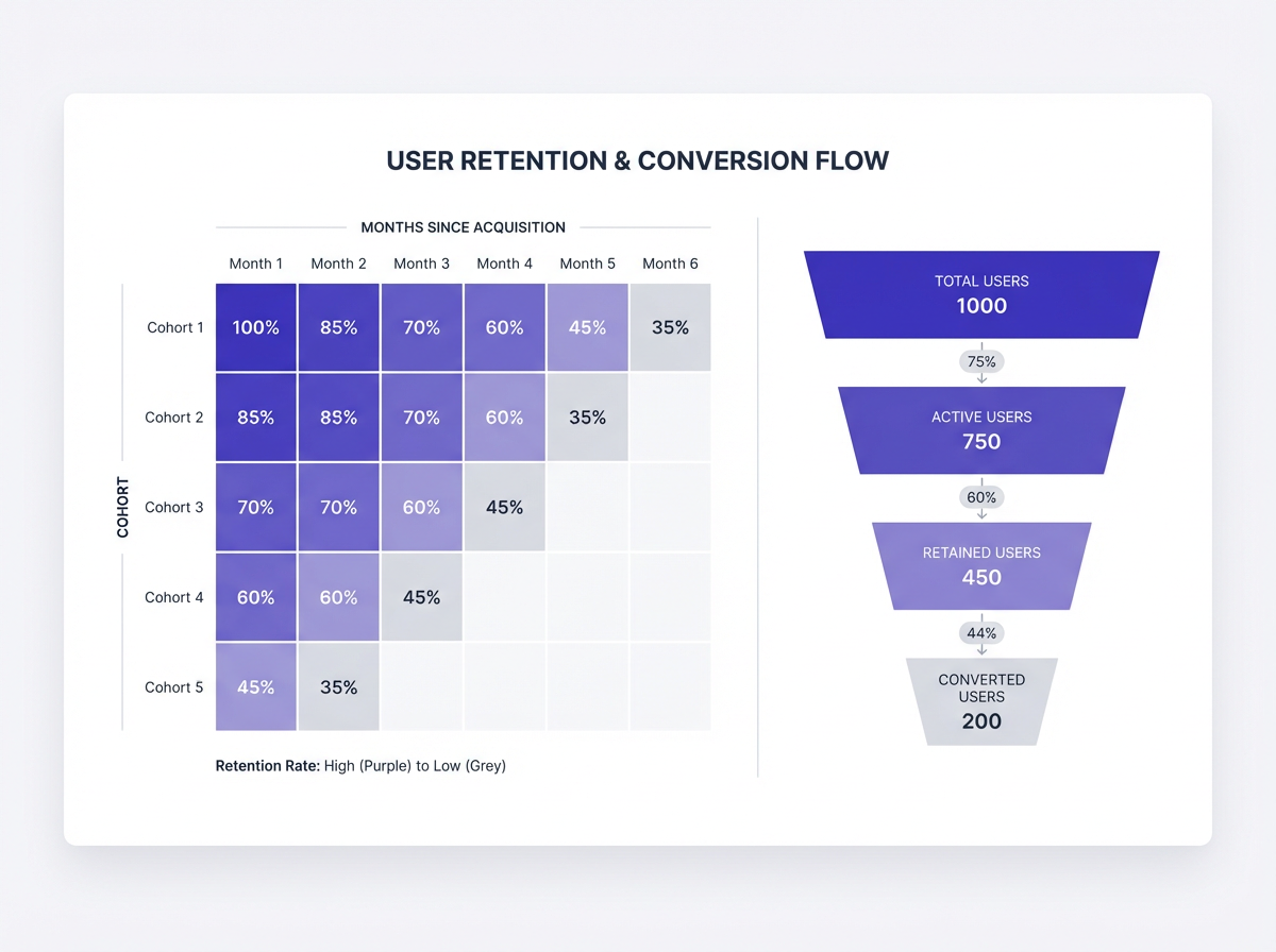
5) Marketing channel performance (spend vs ROI)
Use this when: You want budget decisions based on return.
Create a marketing performance chart set.
Goal: Compare channels by spend, CAC, and ROI.
Data (table): [PASTE: channel, spend_usd, conversions, cac_usd, roi_percent]
Visuals: (1) Bubble chart: x=CAC, y=ROI, bubble size=spend. (2) Ranked bar: conversions by channel.
Rules: Label top 5 bubbles. Add median lines for CAC and ROI.
Design: Minimal gridlines, brand colors.
Output: PNG 1920x1080 and SVG.
Return: Charts plus a 5-bullet action list.
6) Website conversion path (drop-off map)
Use this when: You need to show where users leave the flow.
Create a conversion path drop-off visualization.
Goal: Show user flow from Landing Page to Purchase.
Data (table): [PASTE: step_name, users, dropoff_percent]
Visual: Step chart with clear drop-off annotations.
Add: 3 hypotheses for the biggest drop-off step.
Design: Flat UI style, brand colors.
Output: PNG 1600x900.
Return: Visual and a short testing plan (3 tests).
7) SaaS unit economics snapshot (LTV, CAC, payback)
Use this when: You want one slide for unit economics.
Create a SaaS unit economics infographic.
Goal: Summarize LTV, CAC, Payback Period, Gross Margin, ARPA.
Data:
ARPA: [VALUE]
Gross Margin %: [VALUE]
Monthly churn %: [VALUE]
CAC: [VALUE]
Payback months: [VALUE]
Rules: Show formulas in small text under each metric.
Visual: 5 metric cards + one simple diagram linking CAC -> Payback -> LTV.
Design: Clean, high contrast.
Output: SVG and PNG 1920x1080.
8) Cash flow runway chart (burn and runway)
Use this when: You need finance clarity for planning.
Create a cash runway visualization.
Goal: Show monthly burn, cash balance, and runway end date.
Data (table): [PASTE: month, cash_in, cash_out, cash_balance]
Visual: Combo chart with bars for net cash flow and line for cash balance.
Add: A vertical marker for projected runway end date.
Design: Use red only for negative net flow.
Output: PNG 1600x900 and PDF A4.
9) Inventory health dashboard (aging + stockouts)
Use this when: You manage retail or supply chain.
Create an inventory health dashboard.
Goal: Show inventory aging, stockout risk, and top SKUs by value.
Data (tables):
Aging: [PASTE: age_bucket, units, value_usd]
Stockout risk: [PASTE: sku, days_of_cover, reorder_point, supplier_lead_days]
Top SKUs: [PASTE: sku, category, on_hand_units, value_usd]
Visuals: Donut for aging, table with conditional formatting for risk, bar chart for top SKUs.
Design: Clear labels, no clutter.
Output: PNG 1920x1080.
10) HR headcount and attrition (monthly)
Use this when: You need workforce reporting that leaders read.
Create an HR headcount and attrition report visual.
Goal: Show headcount trend and attrition rate by month.
Data (table): [PASTE: month, headcount, hires, exits, attrition_percent]
Visuals: Line for headcount, bars for hires and exits, small card for YTD attrition.
Rules: Annotate any month where attrition > [THRESHOLD]%.
Design: Neutral tones with one accent color.
Output: SVG + PNG 1600x900.
11) Project status infographic (RAG + milestones)
Use this when: You need a simple status update for many projects.
Create a project portfolio status infographic.
Goal: Show status for [N] projects with milestones.
Data (table): [PASTE: project, owner, status(R/A/G), next_milestone, due_date, risk_note]
Visual: Grid of project cards with RAG dot, due date, and one risk line.
Rules: Sort by status then due date.
Design: Use red/amber/green with accessible shades and text labels.
Output: PNG 1920x1080.
12) Product usage dashboard (activation and stickiness)
Use this when: You need product metrics that explain adoption.
Create a product usage dashboard.
Goal: Show activation rate, weekly active users, and feature adoption.
Data:
Activation funnel: [PASTE: step, users, conversion_percent]
WAU trend: [PASTE: week, wau]
Feature adoption: [PASTE: feature, percent_users]
Visuals: Funnel, line chart, horizontal bars.
Add: 3 callouts for the biggest adoption gaps.
Output: SVG + PNG 1920x1080.
13) Customer segmentation infographic (persona cards)
Use this when: Sales and marketing need shared segments.
Create a customer segmentation infographic with persona cards.
Goal: Summarize 4 segments with size, value, needs, and channels.
Data (table): [PASTE: segment, percent_customers, arpa, top_need, top_channel, key_objection]
Visual: 4 equal cards with an icon, 3 stats, and 2 short text lines.
Rules: Keep each line under 10 words.
Design: Brand colors, consistent icons.
Output: PNG 1600x900 and PDF A4.
14) Competitive comparison chart (feature matrix)
Use this when: You need a clear battlecard visual.
Create a competitive feature comparison matrix.
Goal: Compare [YOUR PRODUCT] vs [COMPETITOR A], [COMPETITOR B], [COMPETITOR C].
Data (table): [PASTE: feature, your_product(yes/no/partial), compA, compB, compC, note]
Visual: Table with checkmarks and short notes.
Rules: Highlight rows where you win. Keep notes under 8 words.
Design: Minimal borders, clear spacing.
Output: SVG and PNG 1920x1080.
15) Service performance infographic (SLA + response time)
Use this when: You report customer support performance.
Create a support performance infographic.
Goal: Show SLA compliance, first response time, and CSAT.
Data (table): [PASTE: month, sla_percent, first_response_minutes, resolution_hours, csat_percent]
Visuals: Line for SLA, bars for response time, card for CSAT.
Rules: Mark any SLA dip below [TARGET]%. Add one likely cause note.
Output: PNG 1600x900.
16) Risk register visualization (impact vs likelihood)
Use this when: You need a risk view leaders can scan.
Create a risk matrix chart.
Goal: Plot business risks by likelihood and impact.
Data (table): [PASTE: risk, likelihood(1-5), impact(1-5), owner, mitigation]
Visual: 5x5 matrix with labeled quadrants.
Rules: Label top 8 risks only. Use dots with short names.
Design: Accessible colors plus text labels (Low/Med/High).
Output: SVG + PNG 1600x900.
17) Pricing and packaging infographic (plan comparison)
Use this when: You need a plan page visual for sales or web.
Create a pricing and packaging comparison infographic.
Goal: Compare 3 plans with clear value differences.
Data (table): [PASTE: plan, monthly_price, best_for, key_features(5 max), limits]
Visual: 3-column plan cards with a highlighted recommended plan.
Rules: Keep each feature under 6 words.
Design: Brand colors, strong hierarchy, no clutter.
Output: PNG 1600x900 and SVG.
18) OKR progress report (objective scorecards)
Use this when: You need a quarterly OKR slide that shows progress.
Create an OKR progress infographic.
Goal: Show progress for 3 objectives and their key results.
Data (table): [PASTE: objective, kr, current, target, status(on/off/at risk)]
Visual: 3 objective blocks, each with 3-5 progress bars for KRs.
Rules: Use percent complete. Add one blocker line for any at-risk KR.
Output: PNG 1920x1080.
19) Regional performance map (sales by region)
Use this when: You need a geo view for sales or ops.
Create a regional performance visualization.
Goal: Show sales by region and growth vs last period.
Data (table): [PASTE: region_name, sales_usd, growth_percent]
Visual: Choropleth map (or tile map if regions are small) + ranked bar chart.
Rules: Use a clear legend. Add arrows for growth up/down.
Design: Color-blind safe scale, readable region labels.
Output: SVG + PNG 1600x900.
20) Board-ready “one metric, one message” infographic
Use this when: You need a single chart that makes one point fast.
Create a board-ready single-message infographic.
Goal: Communicate one key metric and one key insight.
Metric: [NAME]
Data (table): [PASTE: period, value]
Insight statement (one sentence): [PASTE]
Visual: One simple chart (line or bar) with one bold callout and one annotation.
Rules: Remove extra gridlines. Keep labels minimal. Use one accent color.
Output: PNG 1920x1080 and PDF A4.
Return: The graphic plus a 30-word speaker note.
Prompt upgrades that improve output quality
These upgrades make Nano Banana Pro outputs more consistent. Add these instructions to any of the 20 prompts based on your needs.
Add layout constraints
- “Use a 12-column grid. Keep spacing in 8px steps.”
- “Keep all text at 12pt or larger for slides.”
- “Limit the palette to 1 accent color plus neutrals.”
Add data validation checks
- “Verify totals equal the sum of rows. If not, flag the mismatch.”
- “Check that percent values stay between 0 and 100.”
- “If a value is missing, label it ‘N/A’ and do not guess.”
Add annotation rules
- “Annotate the top 1 increase and top 1 decrease only.”
- “Use short callouts: 6 words max.”
- “Explain one cause and one next step.”
Add export rules for each channel
- Slides: PNG 1920x1080, safe margins 24px
- Web: SVG, responsive width, optimized paths
- Print: PDF A4, 300 DPI images, 10mm margins
Common business use cases and the best prompt to pick
If you want speed, you should match the use case to the right prompt. Use this list as a quick picker.
Leadership meeting
- Pick Prompt 1 (Executive KPI dashboard)
- Pick Prompt 20 (One metric, one message)
Sales planning
- Pick Prompt 3 (Pipeline funnel)
- Pick Prompt 19 (Regional performance)
Marketing budget review
- Pick Prompt 5 (Spend vs ROI)
- Pick Prompt 6 (Conversion path)
Product and customer success
- Pick Prompt 4 (Cohort churn heatmap)
- Pick Prompt 12 (Product usage dashboard)
- Pick Prompt 15 (SLA and response time)
Finance and operations
- Pick Prompt 8 (Cash runway)
- Pick Prompt 9 (Inventory health)
- Pick Prompt 16 (Risk matrix)
Frequently Asked Questions (FAQs)
What is Nano Banana Pro used for in business reporting?
Nano Banana Pro can generate charts, dashboards, and infographics from your inputs. It can also apply layout rules, brand styles, and export specs.
What data format should I paste into the prompt?
You should paste a simple table with field names. CSV-style rows work well. You should include units and time periods.
How do I keep charts consistent across teams?
You should standardize brand colors, fonts, and output sizes. You should reuse one prompt template and one naming system for fields.
How do I prevent wrong totals or misleading scales?
You should add validation rules in the prompt. You should also define if values are totals or averages and set axis bounds when needed.
Which export format is best for infographics?
SVG works best for web and editing. PNG works best for slides. PDF works best for print and board packs.
Can I use these prompts for client-facing infographics?
Yes. You should add brand rules, accessibility rules, and a short caption. You should remove internal metrics that clients should not see.
Final Thoughts
These 20 Nano Banana Pro prompts for business (data visualization, infographics) help you turn raw numbers into clear visuals that support decisions. Copy one prompt, paste your data, and set strict brand and export rules. If you want faster weekly reporting, start with the executive KPI dashboard prompt, then build a small library your team reuses for every deck and report.
Call to action: Pick one prompt from this list, run it with last month’s data, and save the final version as your team’s default template for the next report.
Frequently Asked Questions
Written by
Raman Singh
Raman Singh is a highly skilled marketing professional who serves as the head of marketing at Copyrocket AI. With years of experience in the field, Raman has developed a deep understanding of all asp
View all postsYour AI Marketing Agents
Are Ready to Work
Stop spending hours on copywriting. Let AI craft high-converting ads, emails, blog posts & social media content in seconds.
Start Creating for FreeNo credit card required. 50+ AI tools included.
Related Articles
 General
NotebookLM For Coders: Turn Docs Into Faster Code
Code work often fails for a simple reason. You do not have the right context at the right time. You read docs in one tab, skim tickets in another tab, and then...
 General
How to Optimize for AI Search in 2026: The Complete Guide
AI search has shifted from experimental feature to primary search method for millions of users. ChatGPT Search, Google AI Overviews, Perplexity, Claude, and Gem...
 General
Claude Opus 4.6 Review: Here's What New!
Claude Opus 4.6 from Anthropic draws attention because teams want an AI model that writes better code, follows instructions, and stays consistent across long se...