GPT Image 2.0 vs Nano Banana 2: Which AI Image Model Wins in 2026?
Raman Singh
Raman Singh is a highly skilled marketing professional who serves as the head of marketing at Copyrocket AI

OpenAI launched GPT Image 2.0 on April 21, 2026 — and within days, creators were already stacking it against Google's Nano Banana 2 (Gemini 3.1 Flash Image). Both models claim best-in-class text rendering, instruction following, and real-world grounding.
But claims are cheap.
In this breakdown, we run both through 13 real-world prompts across character consistency, branding, translation, object removal, infographics, comic generation, and multi-slide carousel design — so you can pick the right tool for your actual workflow.
Key Takeaways
GPT Image 2.0 wins 10 of 13 head-to-head prompt tests, outperforming Nano Banana 2 on character consistency, branding, sports graphics, Punjabi translation, ultra-wide banners, and conversational carousel generation.
Nano Banana 2 wins object removal and infographic generation, where it preserves scene aesthetics better and produces visually richer diagrams.
GPT Image 2.0 uses O-series reasoning and a December 2025 knowledge cutoff, enabling real-time web grounding — it correctly rendered the 2025/26 Bayern Munich jersey and accurate match scores on the day of the game.
Nano Banana 2 is Google's Gemini 3.1 Flash Image model, released February 26, 2026 — offering Pro-level visual quality at Flash-level speed, available via the Gemini app, Vertex AI, Google Search, and the Gemini API.
GPT Image 2.0 is cheaper at every quality tier: API pricing starts at $0.006 per image at 1024×1024 (low quality), undercutting GPT-Image-1.5 at every tier.
For creators using AI image generation in content workflows, GPT Image 2.0 is the stronger all-rounder — but Nano Banana 2 is the better choice for photo editing and inpainting tasks.
Download 20,000+ AI Prompts here.
What Is GPT Image 2.0?
GPT Image 2.0 — officially named gpt-image-2 in OpenAI's API — is OpenAI's latest image generation model, launched on April 21, 2026. It follows GPT-Image-1 (March 2025) and GPT-Image-1.5 (December 2025), and represents what OpenAI's Research Lead Boyuan Chen described as an architecture "revamped from scratch."
The model is not a traditional diffusion model. OpenAI describes it as a "generalist model" — a "GPT for images" — integrating O-series reasoning to plan layout, search the web, and synthesize uploaded documents before rendering. It ships in two modes inside ChatGPT:
Instant — the base quality upgrade, available to all ChatGPT plans
Thinking — reserved for Plus and Pro subscribers, with a Pro-exclusive ImageGen Pro layer on top
GPT Image 2.0 Core Features
Feature | Detail |
|---|---|
Knowledge cutoff | December 2025 |
Architecture | Revamped from scratch (non-diffusion, generalist) |
Reasoning integration | O-series (web search, doc synthesis, layout planning) |
Text rendering | Dramatically improved — readable in dense compositions |
Max resolution | 4K (via API beta) |
Multilingual support | Yes — multilingual text in images |
API model string |
|
ChatGPT alias |
|
Availability | ChatGPT (Instant/Thinking), API, Microsoft Foundry |
GPT Image 2.0 Pricing (API, per image at 1024×1024)
Quality Tier | Price Per Image |
|---|---|
Low | $0.006 |
Medium | $0.053 |
High | $0.211 |
What Is Nano Banana 2?
Nano Banana 2 is Google's official name for Gemini 3.1 Flash Image — the latest member of the Nano Banana image model family. Google announced it on February 26, 2026, positioning it as their "best image generation and editing model" that combines Pro-level visual quality with Flash-level speed and pricing.
The Nano Banana family launched in August 2025 as the native image generation capability inside Gemini, went viral, and spawned Nano Banana Pro in November 2025 before this Flash variant arrived. Nano Banana 2 is now Google's default image model inside the Gemini app.
Nano Banana 2 Core Features
Feature | Detail |
|---|---|
Official model name | Gemini 3.1 Flash Image |
Launched | February 26, 2026 |
Speed | Flash-level — optimized for high-volume, low-latency use |
Visual quality | Pro-level fidelity |
World knowledge | Real-time via web search grounding |
Text rendering | Improved — accurate in most single-language cases |
Watermarking | SynthID invisible watermark + C2PA Content Credentials |
Thinking levels | Minimal (default), High, Dynamic |
Subject consistency | Multi-frame character consistency supported |
Availability | Gemini app, Google Search, AI Studio, Vertex AI, Adobe Firefly, Figma, Notion |
Aspect ratios supported | 14 native ratios (16:9, 9:16, 2:1 and more) |
Head-to-Head: 13 Prompt Tests
We ran both models through 13 distinct use cases and scored each category. Here are the results:
Summary Scorecard
# | Test Category | Winner | Notes |
|---|---|---|---|
1 | Character consistency (5 scenes) | ✅ GPT Image 2.0 | More accurate face match across all 5 scenes |
2 | Character outfit change | ✅ GPT Image 2.0 | Followed "don't beautify / don't alter body" exactly |
3 | Branding / social ad poster | ✅ GPT Image 2.0 | More eye-catching; watermark and bright colors correct |
4 | Real-time sports graphic | ✅ GPT Image 2.0 | Accurate score, current season jersey, Bayern context correct |
5 | Image translation (Punjabi) | ✅ GPT Image 2.0 | Maintained aesthetic; correct translation; preserved $500 value |
6 | Multi-image / product family | ✅ GPT Image 2.0 | Better proportions; appropriate sample sizes |
7 | Object removal | ✅ Nano Banana 2 | Cleaner inpainting; maintained room aesthetics |
8 | Infographics from notes | ✅ Nano Banana 2 | Richer visual style; added relevant icons and animations |
9 | UGC ad creation | ✅ GPT Image 2.0 | Face consistent; layout correct; features accurate |
10 | Ultra-wide banner (4:1) | ✅ GPT Image 2.0 | Left clean space as instructed; futuristic aesthetic |
11 | Blog URL → infographic | ✅ GPT Image 2.0 | Read blog content factually; included all 6 correct elements |
12 | Comic generation (6-panel) | ✅ GPT Image 2.0 | Character consistency across panels; rich detail |
13 | Conversational carousel | ✅ GPT Image 2.0 | Maintained color/aesthetic across all slides; no drift |
Final score: GPT Image 2.0 — 10/13 | Nano Banana 2 — 2/13 | Tied — 1/13 (object removal shadow issue on both)
Character Consistency
The first test used a real person's photo as reference and asked both models to place that character in 5 different scenes: sunrise café, busy street, creator studio, speaking on stage, and working late at night.
Here's prompt I used;
Use Image 1 as the main character reference. If additional reference images are available, use them to preserve the same face, hairstyle, body type, clothing language, and overall identity across every panel. Create a cinematic 16:9 five-panel storyboard featuring the exact same character across all 5 scenes. The character must remain visually consistent in face, age, hair, skin tone, body proportions, and clothing identity. No face drift. No redesign. Scene 1: The character is sitting in a quiet café at sunrise, planning the day in a notebook, soft warm light. Scene 2: The same character is walking quickly through a busy city street, afternoon energy, phone in hand. Scene 3: The same character is recording a video in a creator studio with camera, soft key light, and desk setup. Scene 4: The same character is speaking confidently on a modern stage during a presentation. Scene 5: The same character is working late at night in front of a glowing monitor, focused and ambitious. Style: realistic cinematic photography, not illustration. Color grade: modern, premium, slightly dramatic but believable. Composition: five clearly separated Images, each visually strong on its own, but clearly part of the same story. Different emotions on face Important constraints: - preserve identity perfectly - maintain wardrobe continuity with only minor scene-appropriate variation - no random extra people dominating frame - no text - no watermark - no panel should look like a different personNano Banana 2 produced decent results for scenes 1, 4, and 5, but the face drifted noticeably in scenes 2 and 3 — rated about 70% accurate. Scene 3 (creator studio) produced a clearly distorted face.
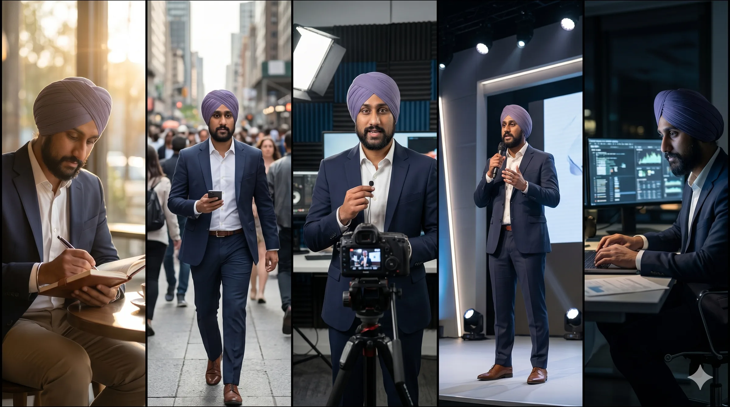
GPT Image 2.0 delivered closer facial match across all scenes. The late-night scene with monitor glow on the face was particularly realistic, with the screen reflection casting accurate light on facial features.
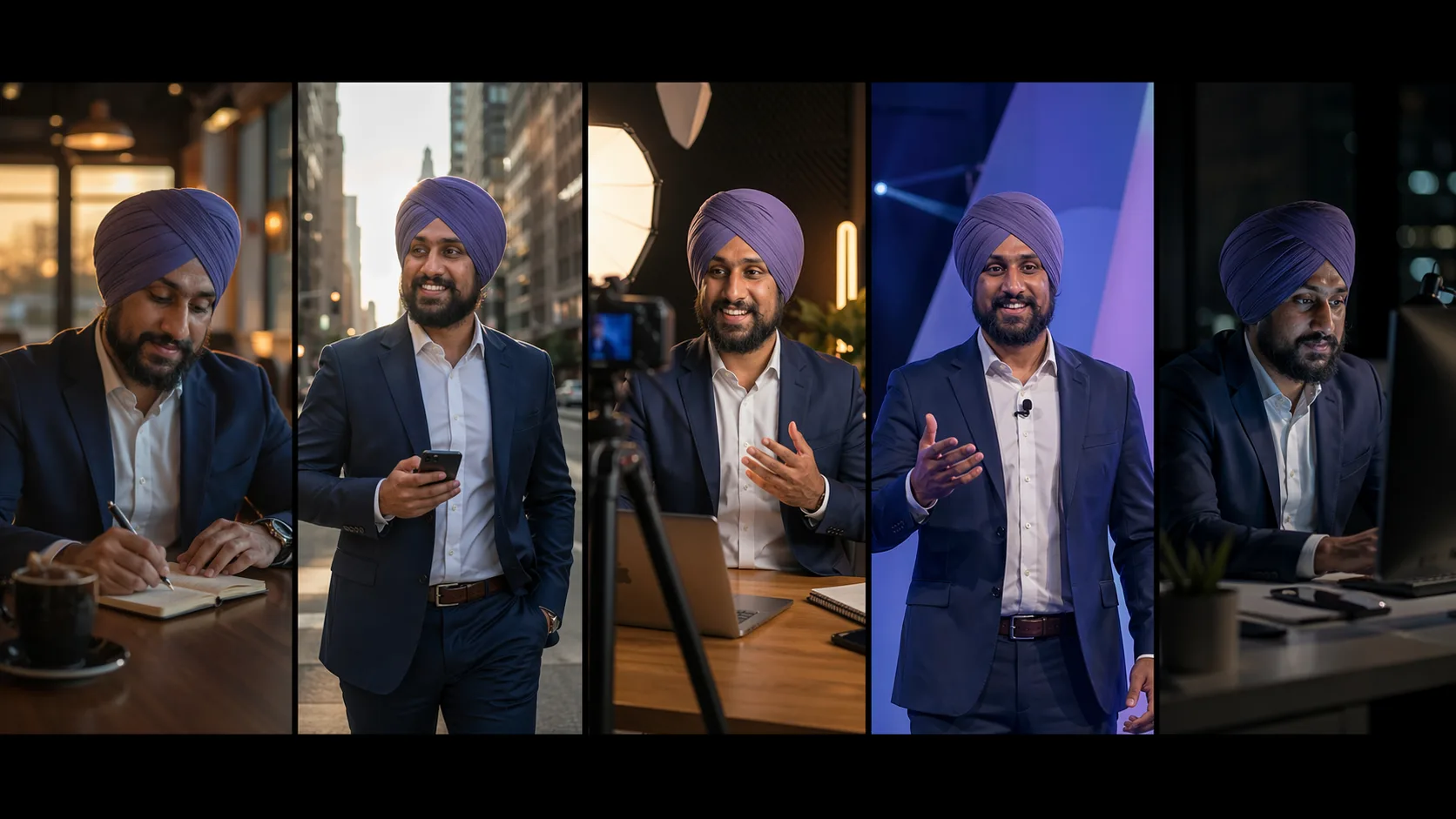
Winner: GPT Image 2.0. Its instruction-following ensures the reference image stays anchored across multiple scene variations.
Outfit Change Without Altering the Character
This prompt specifically instructed both models: do not beautify the face, do not change ethnicity, do not alter body shape. Only change the clothing to a smart casual creator look — off-white over-shirt, black inner t-shirt, clean tailored trousers.
Here's prompt i used;
Edit Image 1 only. Change only the clothing and fashion styling of the person in Image 1. Preserve the exact same face, hair or turban details, beard, skin texture, body proportions, pose, camera angle, background perspective, and lighting logic. This must feel like the same real person in the same real photo after a wardrobe change. Requested changes: - replace current outfit with a premium smart-casual creator look - fitted off-white overshirt, black inner t-shirt, clean tailored trousers - add a subtle premium metallic wristwatch - refine clothing folds so the garments look naturally worn - keep original expression and eye direction - keep background untouched - keep lighting untouched - do not beautify the face - do not change ethnicity, age, or identity - do not alter body shape - do not generate a new person Style target: believable editorial realism, high-end but natural, no fake skin, no warped hands, no duplicate features. No text, no watermark.GPT Image 2.0 executed this precisely. The face, body pose, and proportions stayed identical. Only the clothing changed.
Nano Banana 2 beautified the face despite the explicit instruction, changed the hair, and shifted the hand position from thigh to back. The instructions were clear — both models read them — but Nano Banana 2 overrode them.
Winner: GPT Image 2.0. Strict instruction adherence matters for professional use cases like fashion, e-commerce, and personal branding.
Branding and Social Ad Poster
Both models received a prompt to create a premium 4:5 social ad poster for an AI membership service called Prompts Love. The test evaluated visual quality, prompt accuracy, and marketing effectiveness.
Here's prompt i used;
Create a premium 4:5 social ad poster for an AI membership brand called "Promptslove".

Visual direction:
Dark luxury background, deep violet and near-black tones, light violet highlights, sharp yellow accents, premium startup ad aesthetic.
A sleek smartphone is centered slightly right, displaying a modern dashboard interface with prompts, templates, and automations.
Around the device, add subtle clean UI cards floating in controlled perspective. Keep layout elegant, not cluttered.

Render this exact text with zero spelling mistakes:
"20,000+ AI PROMPTS"
"200+ AUTOMATIONS"
"ONE MEMBERSHIP"
"PROMPTSLOVE.COM"

Typography:
- large bold geometric sans-serif for headline
- clean hierarchy
- crisp letterforms
- strong spacing discipline
- marketing-ready composition

Composition:
- top area: headline
- middle: phone hero shot
- bottom: CTA and product support lines
Important:
- text must be highly legible
- avoid nonsense small text
- no extra logos
- no watermark
- no generic sci-fi style
- should look like a real paid ad creative from a premium SaaS brand
GPT Image 2.0 produced a polished poster with a mockup, factually correct on-screen text, a CTA watermark, and bright colors that match the described brand tone.
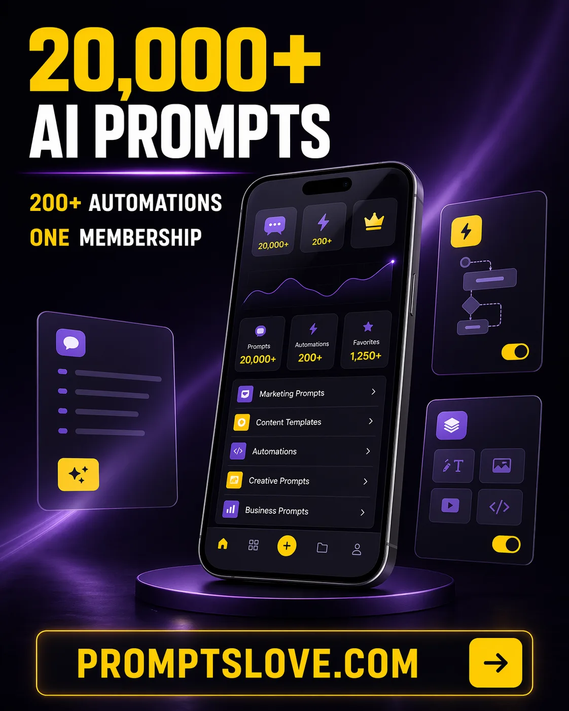
Nano Banana 2 produced a clean, minimal design — but the text had spelling errors on some elements, and the overall look was too flat to stop a scroll.
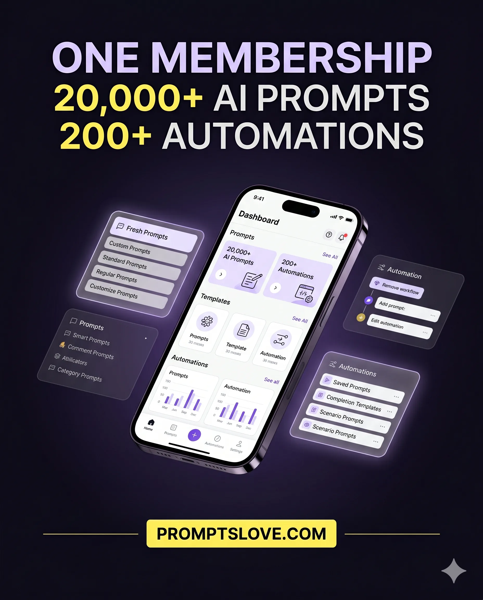
Winner: GPT Image 2.0. For marketing teams, spelling accuracy and visual impact are non-negotiable.
Real-Time Sports Graphic
This test challenged both models to produce a breaking-news-style sports graphic for a same-day match result: Bayern Munich vs. Bayer Leverkusen, DFB-Pokal Semi-final. The final score was 2-0 to Bayern, who reached the final for the first time in six years.
Here's prompt I used;
Create a vertical 9:16 breaking-news style sports graphic based on the latest verified information about Bayern Munich vs Bayer Leverkusen DFB Pokal Semi Final Requirements: - use current real-world information to make the visual accurate - include the correct teams, competition, and outcome if applicable - clean modern sports graphic design - premium broadcast aesthetic - dramatic but not clickbait-fake - include team colors accurately - include a bold headline area - include a smaller summary area - include one central action visual or symbolic representation of the match - do not invent statistics - do not include wrong dates or wrong opponent names - no watermark Style: modern mobile-first sports media card, high contrast, clean typography, social-post ready. Exact text to include: "Guess Who's Back" "Will Bayern Make it?" "Bayern Munich VS Bayer Leverkusen, 22 April 2026" Make it look like a real sports media asset suitable for Instagram Stories or YouTube Shorts coverage.Since Nano Banana 2 has real-time web search capability, the expectation was strong performance here. It did retrieve the correct score and date — but the zero in the scoreline had low opacity and was nearly invisible, and some in-image text was garbled and unreadable.
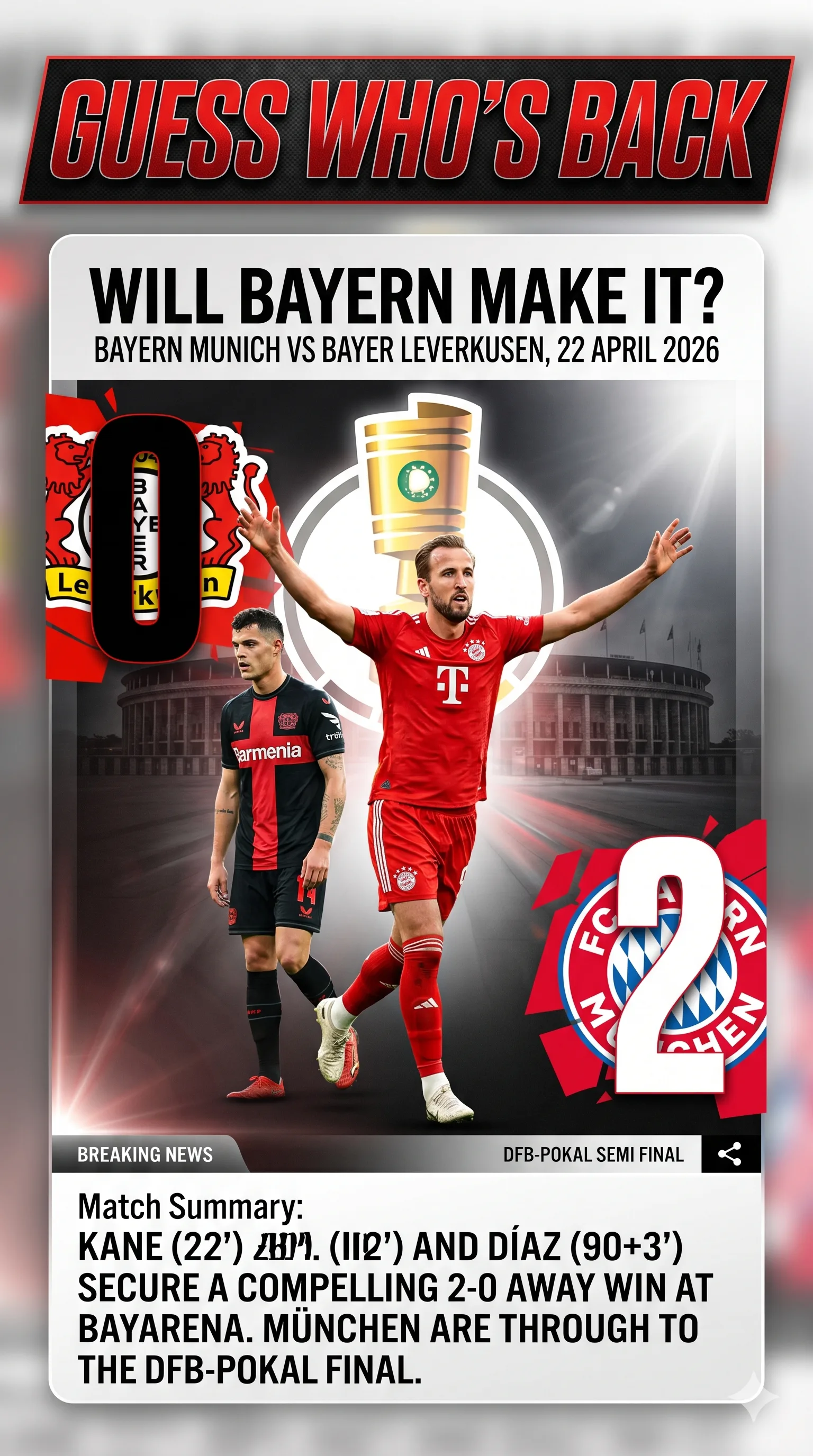
GPT Image 2.0 not only got the score right but used the current 2025/26 season jerseys for both clubs (Nano Banana 2 showed older jerseys), rendered both players in dynamic poses, and included the contextual headline about Bayern reaching the final for the first time in six years. Every detail was accurate.
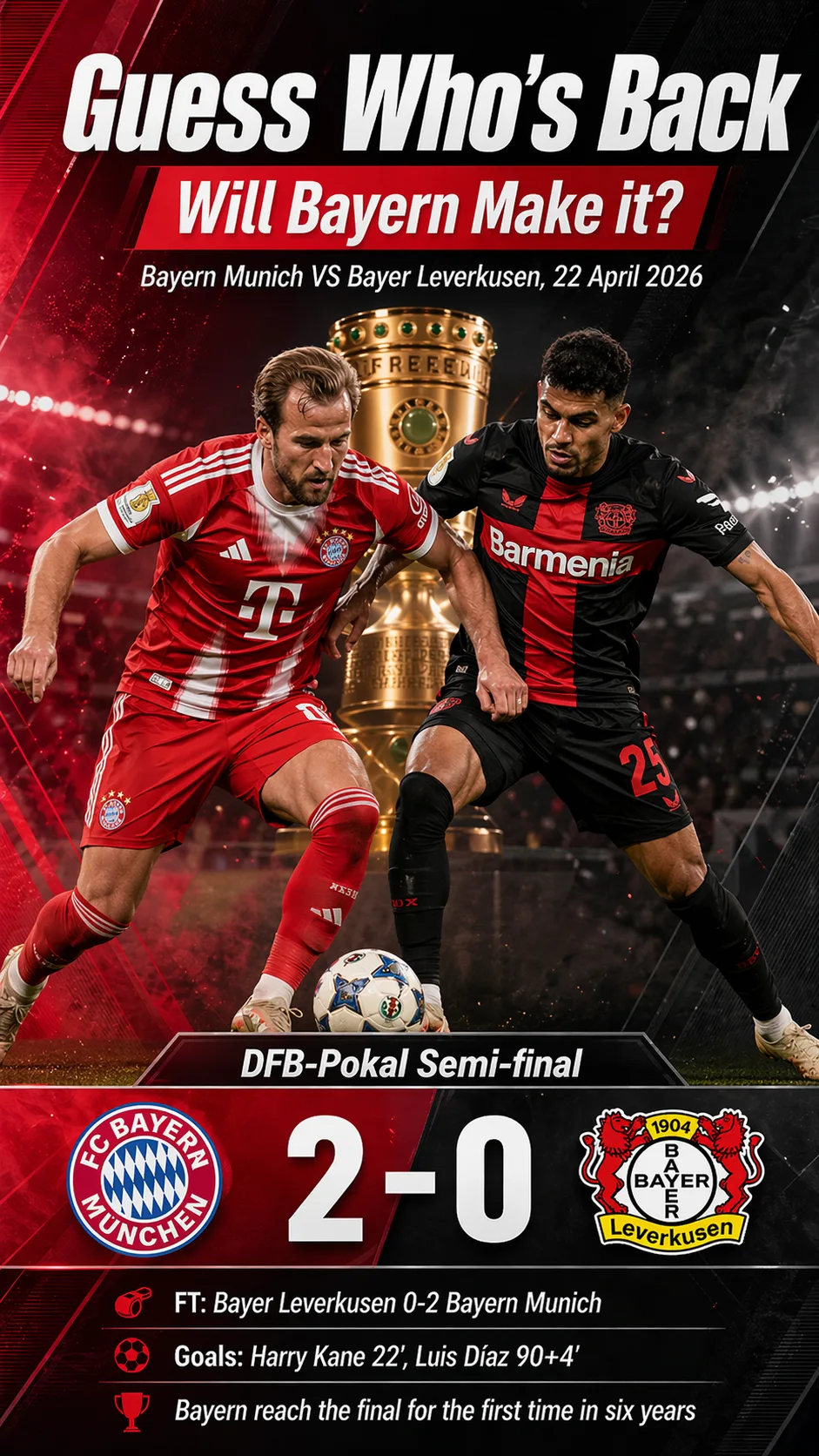
Winner: GPT Image 2.0. Real-time grounding combined with strong text rendering is a powerful combination for news, sports, and live content.
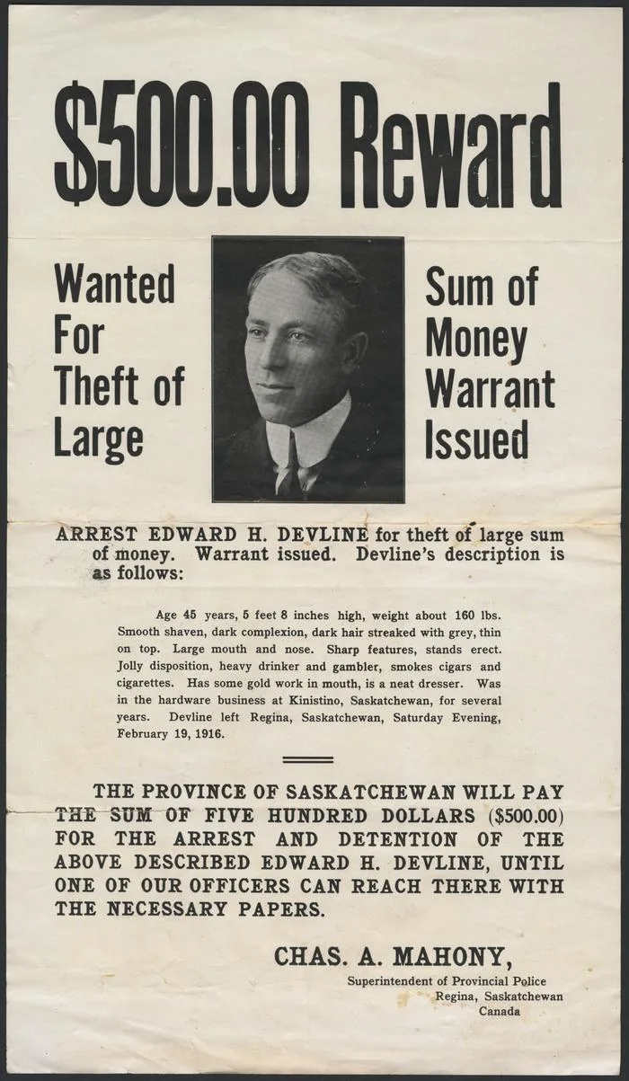
Translation: Maintaining Aesthetics Across Languages
An English poster was translated into Punjabi. The test measured whether both models could accurately translate text while preserving the original design.
Original image;
Here's prompt I used;
Edit Image 1 only. Translate all English text in the existing poster into Punjabi while preserving the original design system. Do not redesign the poster. Keep the same visual hierarchy, spacing, image placement, alignment, color palette, typographic mood, and brand feel. Rules: - replace text only - preserve the existing composition as closely as possible - maintain emphasis and hierarchy - preserve line balance and spacing - keep logos, icons, product images, shapes, and background exactly where they are - no additional wording - no side explanations - no translation notes outside the design Output should look like a professionally localized version of the same poster, not a newly designed one. No watermark.GPT Image 2.0 maintained the full aesthetic of the original, rewrote every text element in accurate Punjabi, and correctly retained a numerical value ($500) that was specified on the original.
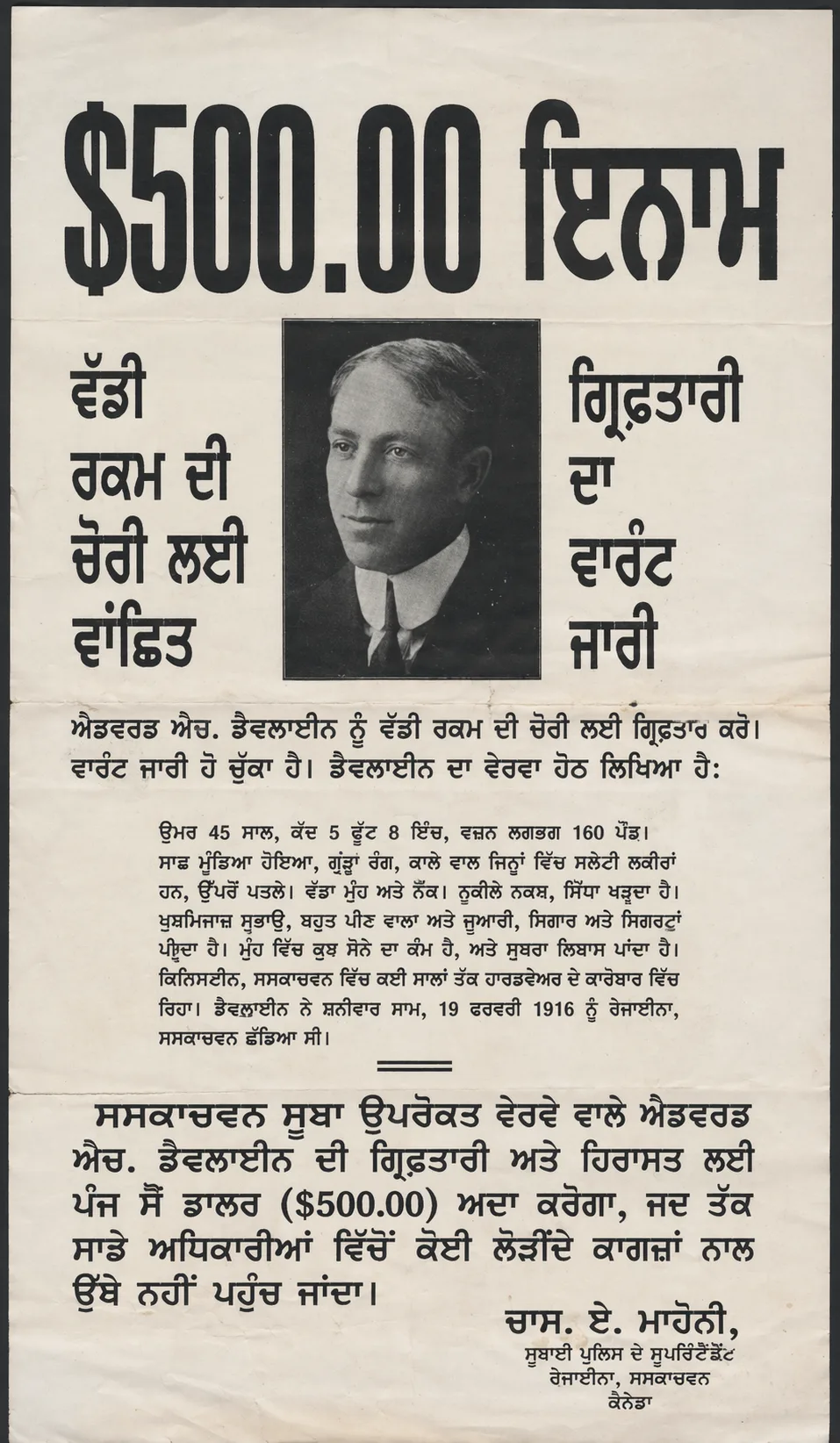
Nano Banana 2 translated most elements correctly but changed the value to $0 instead of $500, repeated one line twice rather than replacing it, and failed to clean up the error. A small mistake — but critical in pricing, promotional, and e-commerce contexts.
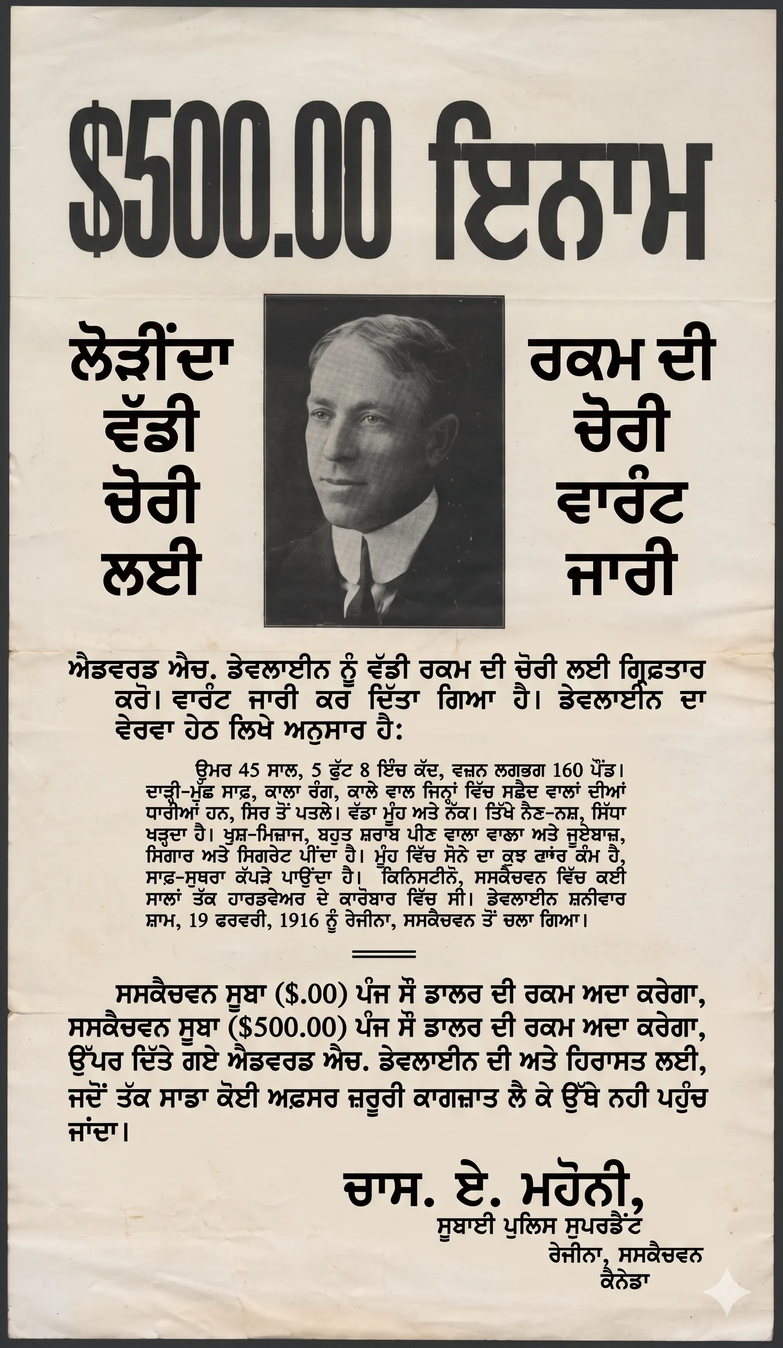
Winner: GPT Image 2.0. For multilingual marketing campaigns, value accuracy is essential.
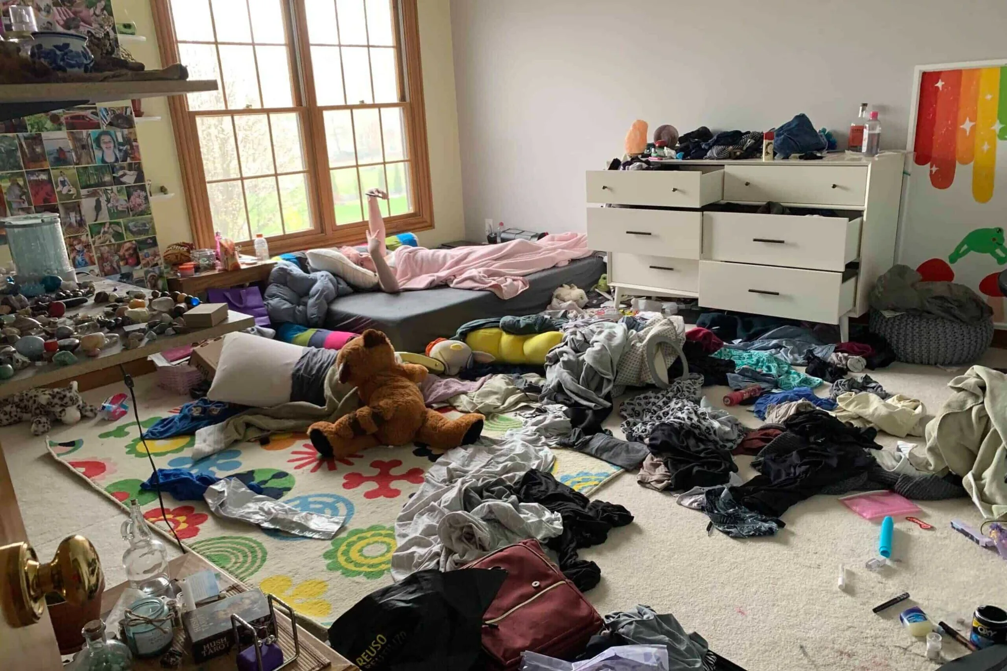
Object Removal
Two tests were run here. In the first — removing a couple and a bag from a family photo — both models performed well, but both left shadow artifacts from the removed figures. It was a draw on execution quality.
Original Image;
Here's prompt I used;
Edit Image 1 only.

Remove the distracting object(s) from the image while preserving everything else exactly. Keep the same camera angle, background geometry, lighting direction, shadow behavior, reflections, texture continuity, and subject placement.

Requested removal:

- Clean the room and tidy up cloths and toys somewhere which looks neat

- reconstruct the hidden background realistically

- preserve the rest of the scene exactly

- do not reframe the image

- do not change subject identity

- do not change color grading

- do not redesign the environment

This must look like the object was never there in the first place.

No collateral edits.

No extra objects added.

No watermark.
In the second — a messy room image where specific furniture pieces needed to be identified and kept — Nano Banana 2 correctly preserved the table, shelf, and side table while maintaining the room's aesthetic.
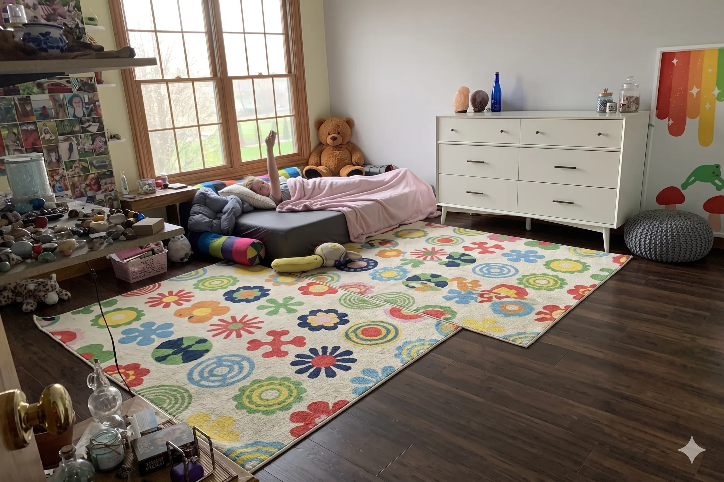
GPT Image 2.0 removed the table entirely along with the other items, erasing something it wasn't supposed to.
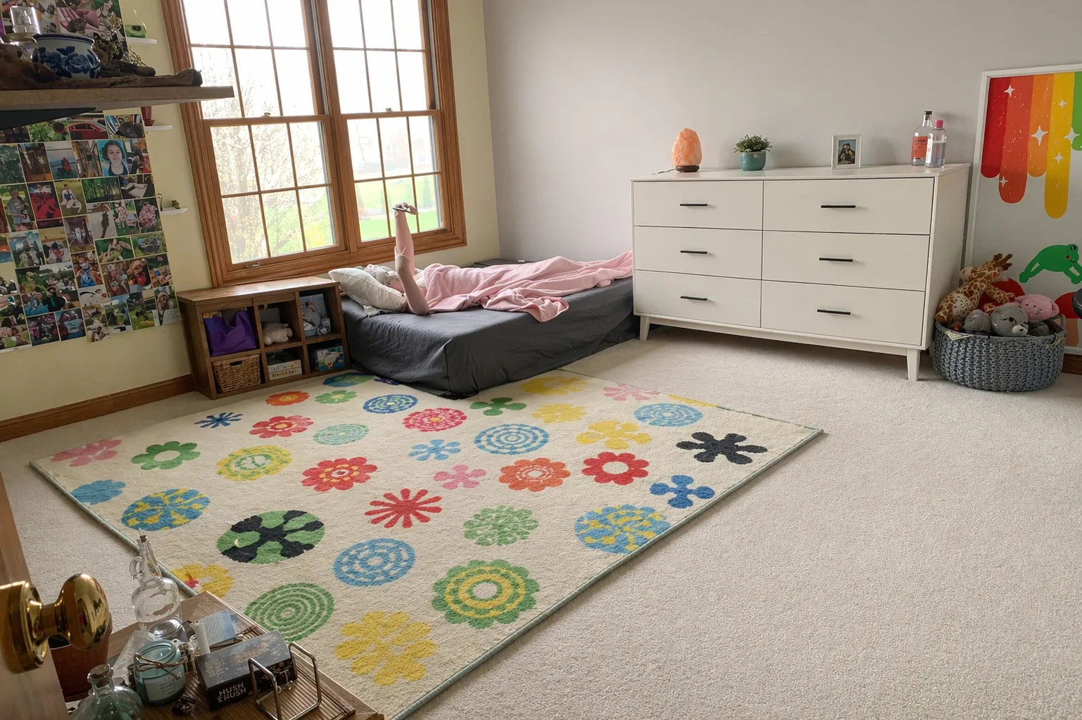
Winner: Nano Banana 2. For inpainting and object removal, Google's model shows stronger spatial reasoning about what to keep versus what to clear.
Infographics from Handwritten Notes
Both models received a photo of handwritten notes about human liver anatomy and were asked to convert them into a colorful infographic with icons, plain background, and handwritten-style font.
Here's prompt I used;
Turn the following rough notes into a clean, premium vertical 9:16 infographic attached notes Requirements: - create a polished editorial infographic - organize the information into clear sections - use strong visual hierarchy - add simple icons or symbolic illustrations where helpful - make the content educational and easy to scan on mobile - preserve factual meaning from the notes - remove redundancy - do not invent unsupported claims - use bold headline, section dividers, and concise supporting text - keep the layout clean and balanced Design direction: dark premium background, violet accent system, yellow highlights, clean modern information design. Important: - text must be readable - spacing must be disciplined - no cluttered generic AI poster feel - no watermarkGPT Image 2.0 produced a clean, well-structured infographic.
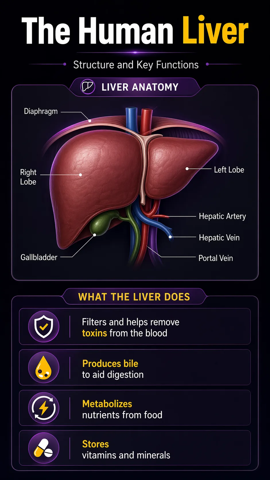
But Nano Banana 2 went further — it added a cute anatomical illustration, labeled key liver functions (toxin filter, bile production, nutrient metabolism, storage), and used more expressive visual design. The layout felt genuinely designed rather than generated.
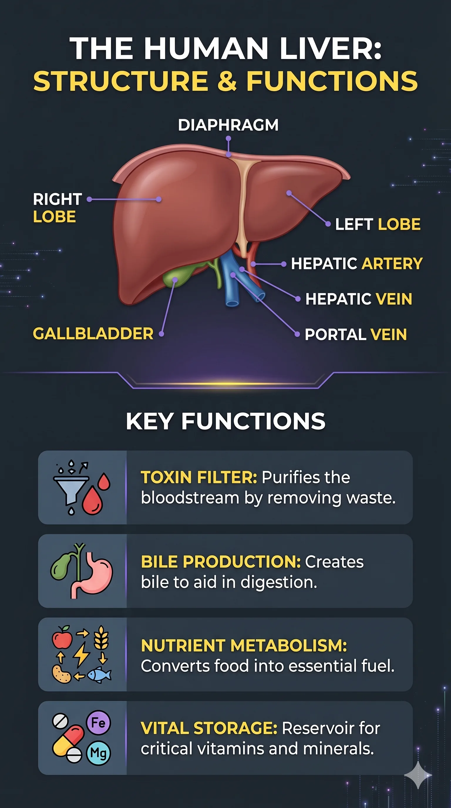
Winner: Nano Banana 2. For educational content, medical diagrams, and data-to-visual workflows, Nano Banana 2's creative infographic output is stronger.
Ultra-Wide Banner Generation
GPT Image 2.0 was tested on its ability to produce ultra-wide banners (4:1 and 8:1 ratios) — a format Nano Banana 2 has historically struggled with. The prompt specified: leave clean space on one side for headline and CTA text, deep violet and black palette, futuristic aesthetic, left-to-right focal flow.
Here's prompt I used;
Create an ultra-wide 4:1 premium website hero banner for an AI productivity brand. Scene: a futuristic but believable creative workspace blending product design, prompt engineering, and automation. Show a central visual flow moving from idea to prompt to output to automation, represented through elegant layered interface elements and realistic environmental depth. Style: clean high-end tech brand, editorial lighting, strong negative space, minimal clutter, subtle depth, premium commercial rendering. Color system: deep violet, black, soft violet, controlled yellow accent details. Requirements: - composition must work beautifully in ultra-wide format - create strong focal flow from left to right - leave clean space for headline and CTA on one side - avoid crowding the center - no generic cyberpunk overload - no watermark This should look like a real homepage hero image designed for a premium SaaS launch.GPT Image 2.0 followed every instruction. The banner left a clean compositional space exactly where specified, used connected screens to show a prompt workflow, and produced a futuristic look with correct text elements (including correctly spelled "idea capture" and "prompt structure").

Nano Banana 2 added the headline text itself — directly contradicting the instruction — and the result was blurred and visually weaker.
Winner: GPT Image 2.0. Complex compositional instructions — especially multi-constraint banner formats — are where GPT Image 2.0's reasoning layer pays off.
Conversational Carousel (Multi-Slide)
Both models created a 4-slide Instagram carousel (4:5 format) about "Why Your Content Flops." The test evaluated whether conversational context carried across slides — meaning the second, third, and fourth slide maintained the same color palette, character design, and aesthetic as the first.
Here's prompt I used;
Create Slide 1 of a 4-slide Instagram carousel in 4:5 format. Topic: "Why Your Content Flops" Goal: Make a high-performing carousel opener with a bold, scroll-stopping design. This should feel like a premium social media marketing post for creators. Text: "YOUR CONTENT FLOPS" Rules: - maximum 4 words only - text must be large, bold, and instantly readable - center-focused composition - clean but dramatic layout - no paragraph text - no small captions - no watermark Design style: - premium creator-economy aesthetic - dark background - bold contrast - modern typography - subtle visual tension - clean negative space - one focal visual, such as a frustrated creator silhouette, analytics dropping, or weak content symbols - should look like Slide 1 of a strong educational carousel Color direction: deep black or charcoal base, white text, strong yellow or red accent for urgency Make it feel like a viral Instagram business/creator carousel cover.GPT Image 2.0 maintained the deep black/charcoal base with white text and yellow urgency accents across all four slides. Character design stayed consistent. Each slide concept was executed with specific, detailed visual metaphors: a broken phone with downward graph for "no clear hook," a browsing person for "same pattern," a sad character brainstorming for "zero story tension."
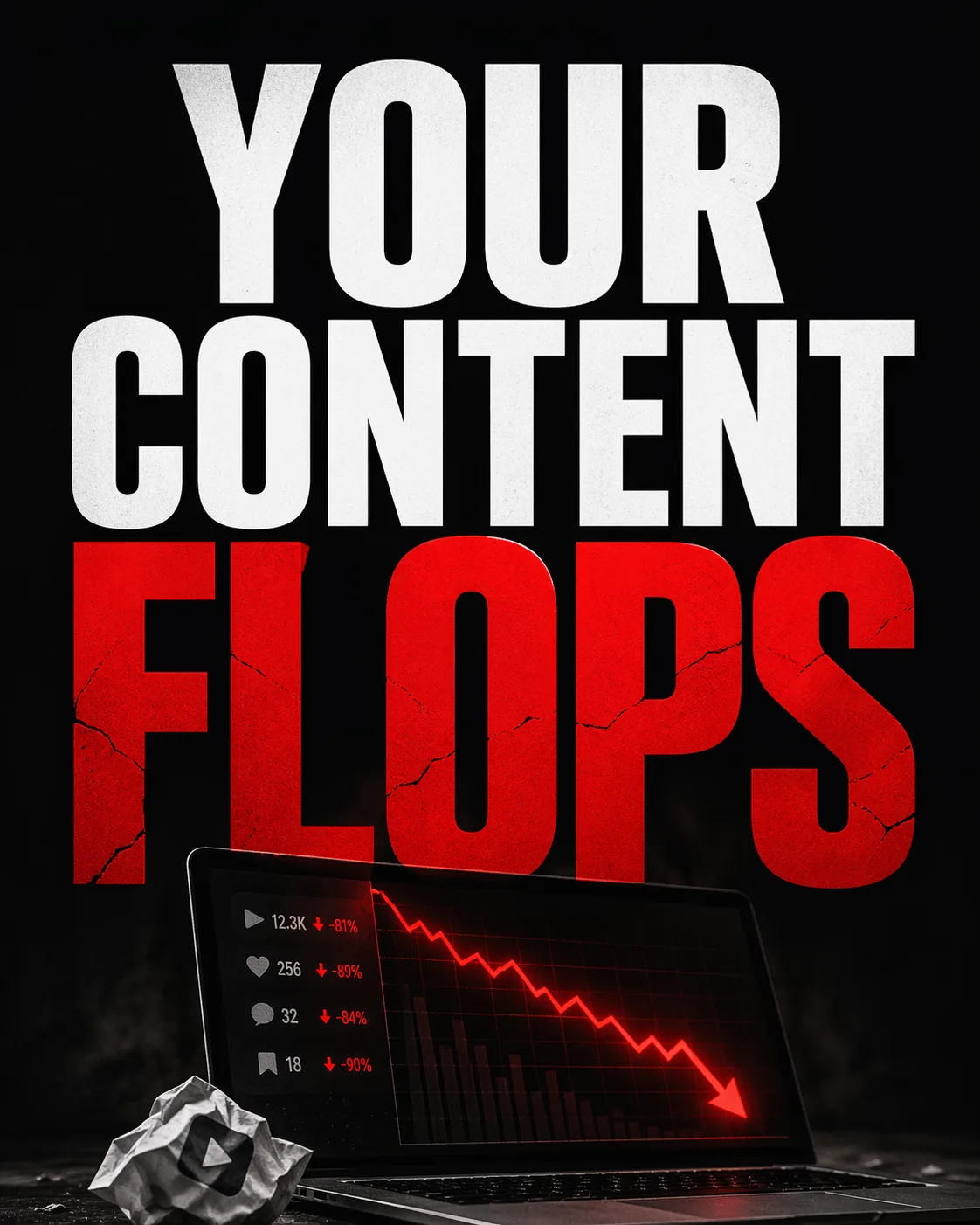
Nano Banana 2 shifted the color scheme on the final slide — a hard break from the defined aesthetic — and some slide concepts were visually underdeveloped.
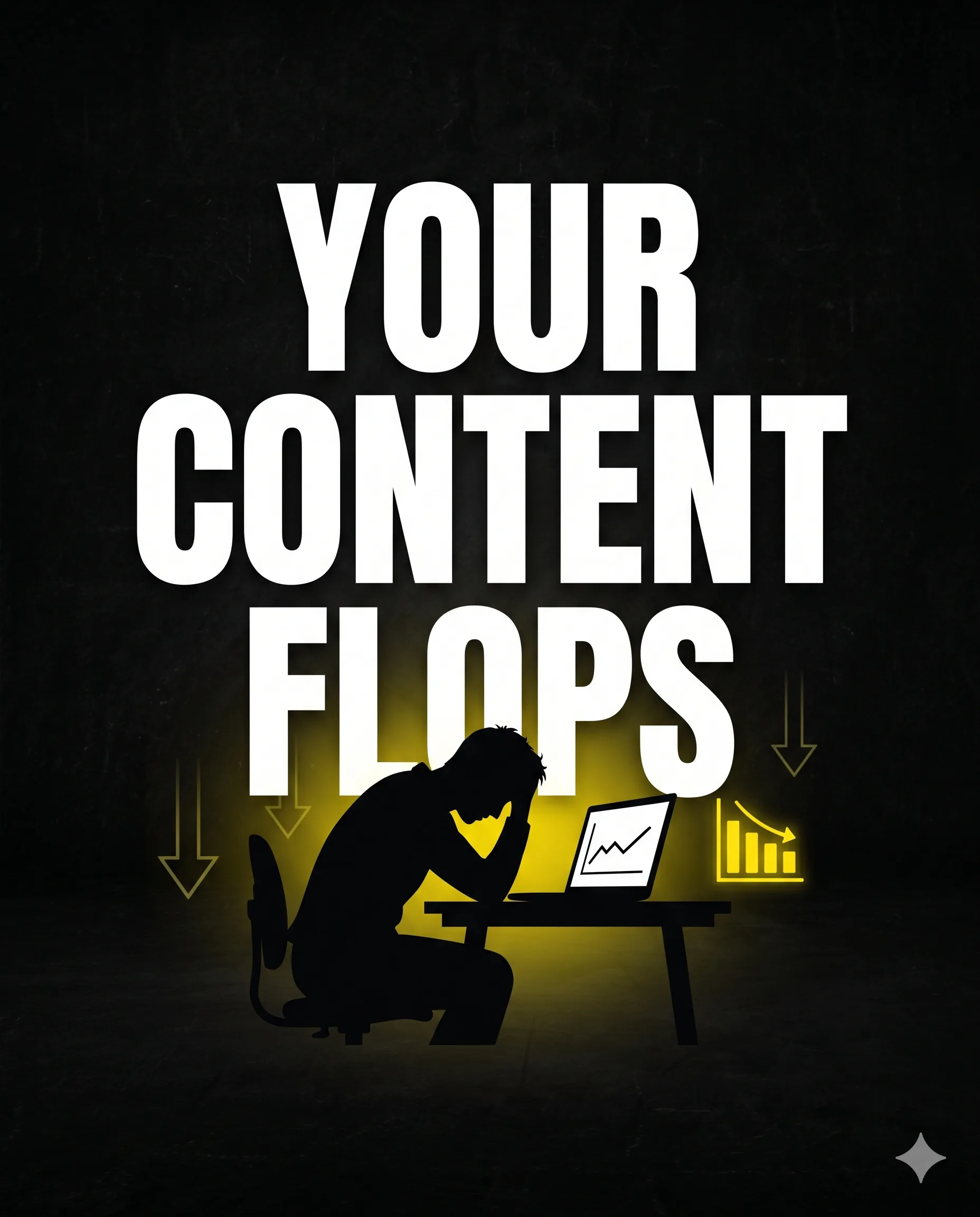
Winner: GPT Image 2.0. Conversational consistency across multi-slide campaigns is critical for social media and it is where GPT Image 2.0's context retention shows clear strength.
Multi-Image Product Family Shot
This test targeted e-commerce use cases — multiple products photographed separately that need to look cohesive when placed together in one scene. The prompt described a supplement brand with several capsule products and asked both models to compose them as a unified product family with consistent lighting.
Here's prompt I used;
Use all uploaded product reference images as visual anchors. Create a premium 16:9 launch banner showing a complete product family lineup on one clean studio surface. Preserve the recognizable design details, label colors, shapes, and material finish of each referenced product while arranging them into a cohesive commercial composition. Goal: show all products as part of one unified family without losing the identity of each item. Style: high-end commercial product photography, soft reflections, premium studio lighting, believable materials, sharp labels, rich shadows, controlled highlights. Composition: - hero product in center - supporting products grouped around it - balanced spacing - clear hierarchy - no random props unless they enhance realism - polished launch-banner look Important: - preserve brand identity of each object - do not mutate labels - do not change bottle or box geometry dramatically - no clutter - no watermarkGPT Image 2.0 placed the products with appropriate relative sizing, clean lighting behind them, and a composition that felt like a studio shot. The capsule sizes looked proportional and realistic.
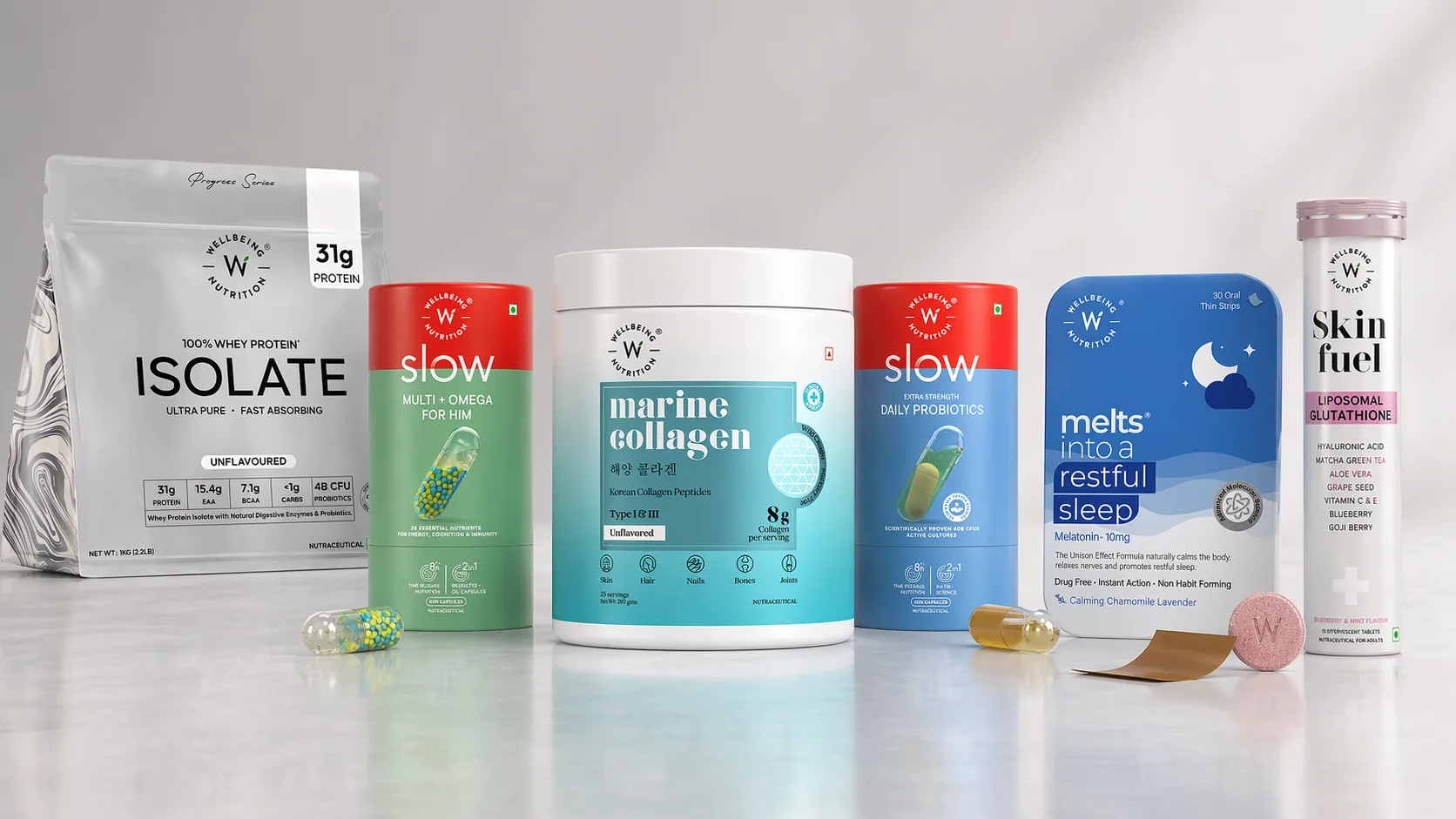
Nano Banana 2 produced an oversized capsule arrangement — the individual products appeared exaggerated in scale compared to each other, making the grouping look unnatural. The lighting was there, but the spatial relationships between objects were off.
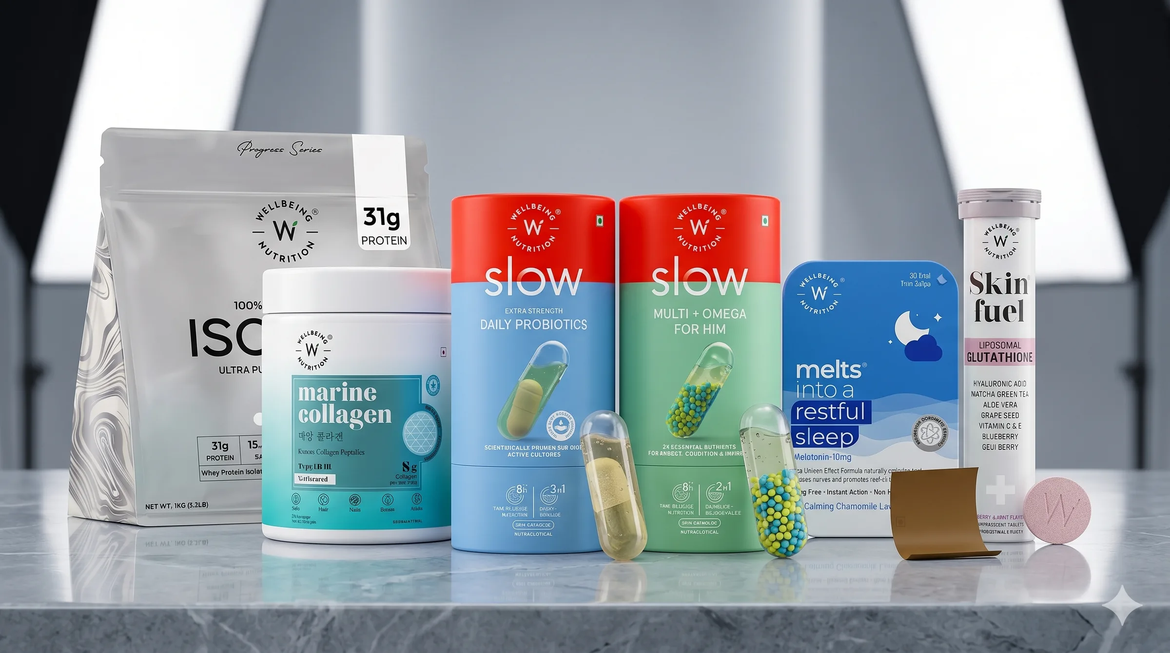
Winner: GPT Image 2.0. For product photography and e-commerce compositing, correct proportional reasoning matters as much as visual quality.
UGC-Style Ad Creation
The prompt asked both models to create a social media ad banner using a reference photo of a real person's face, promoting three key offerings: prompts, templates, and automations. The headline was "Stop Writing From Scratch." Both models needed to maintain character likeness and produce a scroll-stopping layout.
Here's prompt I used;
Use Image 1 as the creator identity reference. Create a vertical 9:16 creator-style paid social ad frame that looks like a paused moment from a high-performing Instagram Reel or YouTube Shorts ad. Preserve the exact facial identity from Image 1. Scene: the creator is in a modern home office, reacting with impressed surprise while pointing toward floating visual cards representing prompts, templates, and automations. The environment should feel real, premium, and creator-focused. Add these exact text overlays: "STOP WRITING FROM SCRATCH" "PROMPTS + AUTOMATIONS" "Build faster with Promptslove" Visual style: authentic UGC energy, but cleaner and more premium than raw selfie content. Natural skin texture, realistic hands, believable room lighting, strong text hierarchy. Constraints: - do not change the person’s identity - do not cartoonize the face - do not add extra fingers - no watermark - no fake app logos unless specifiedGPT Image 2.0 kept the face very close to the reference image, rendered all three feature labels correctly, included the bold headline, and showed a clean CTA. The overall layout felt ad-ready.
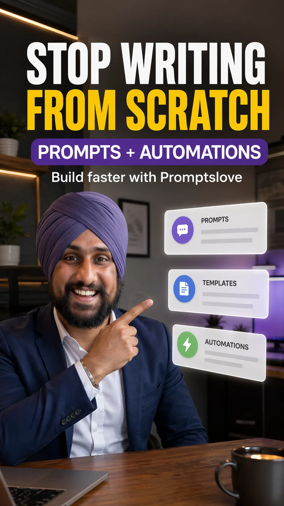
Nano Banana 2 produced a banner that added an unexplained video player UI element (pause button, timeline bar) in the design — something the prompt never asked for. The font also lacked visual weight, making it unlikely to stop a scroll.
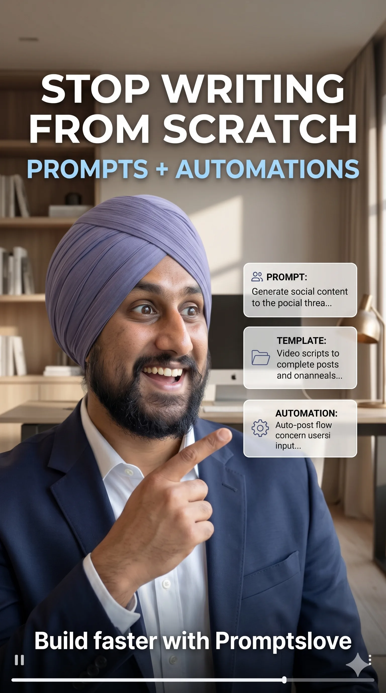
Winner: GPT Image 2.0. For UGC-style ads and personal brand campaigns, face likeness and layout discipline are both required — and GPT Image 2.0 delivers both.
Blog URL to Infographic
A blog post URL was passed to both models with the instruction to convert the article's content into a colorful step-by-step infographic. The blog covered how to write better Claude prompts — with six elements: goal, outcome, context, role, format, quality bar, and examples.
Here's prompt I used;
Turn This Blog [url] into Infographic Explainer. - Create Colorful Explanation Explaining the process - Use Icons on each step explanation - Use Plain background (light) - Handwritten Style fonts - Explain with an example - Keep space in between them - Keep Colors combination Constraints: - Don't overuse the icons Aspect Ratio 9:16GPT Image 2.0 read the blog accurately and included all six elements in the correct structure, including a reusable prompt formula that appeared in the original article. Every label matched the source content.
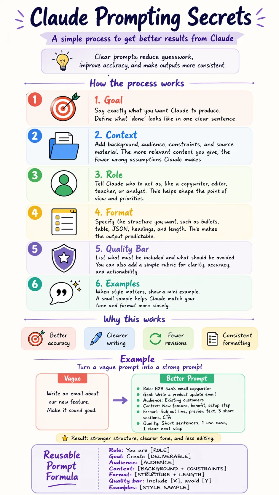
Nano Banana 2 substituted several labels with its own interpretation of what a "prompt guide" should contain, rather than pulling from the actual blog. The result was a clean infographic — but factually incorrect relative to the source material.
Winner: GPT Image 2.0. When converting URL-sourced content to visuals, factual fidelity to the source matters. GPT Image 2.0's web-reading capability makes it the reliable choice here.
Comic Generation (6-Panel)
Both models were asked to generate a 6-panel comic strip on the theme of AI overwhelm — depicting a content creator navigating too many tools. No dialogue was pre-written; both models had to invent it. The strip needed to be more expressive and graphic than text-heavy.
Here's prompt I used;
Create a vertical 9:16 anime-style comic page with a clear panel grid layout. Topic: "AI Did My Job, Then Saved It" Style: - modern anime / manga-inspired style - expressive faces - clean line art - cinematic shading - vibrant but controlled colors - polished digital anime look - dynamic emotional storytelling - premium and mobile-friendly - not chibi, not cartoonish western comic style Layout: - use a clean 2-column by 3-row grid, total 6 panels - all panels must be clearly separated with visible comic gutters - panel sizes should be balanced and readable on mobile - preserve a strong visual flow from top to bottom - make it feel like a real comic page, not just a collage of scenes Storyline: This page should tell the beginning of the story. A young Indian male content creator fears that AI will replace his work. He sees AI tools everywhere and feels overwhelmed. By the end of the page, he begins to realize that AI might actually help him instead of replacing him. Main character: - young Indian male content creator - modern hairstyle or turban if chosen, but keep one identity consistently across all panels - expressive anime face - same clothes throughout the page, with slight natural movement - should look like the same person in every panel Panel breakdown: Panel 1: The creator is sitting at his desk, staring at his laptop with a worried face. Multiple tabs or floating screens suggest AI tools and automation. Mood: anxious, tense. Panel 2: Close-up reaction shot. His eyes widen as he sees headlines or content about AI replacing jobs. Mood: fear and disbelief. Panel 3: He imagines being left behind while AI tools rapidly create writing, design, and automation outputs around him. Mood: overwhelmed, chaotic. Panel 4: He leans back, frustrated, thinking his job is finished. Mood: low point, defeat. Panel 5: He notices AI helping organize ideas, improve writing, and speed up content planning on his screen. Mood: confusion turning into curiosity. Panel 6: He looks forward with a more hopeful expression as he realizes AI can help him work smarter. Mood: relief, optimism, breakthrough. Text: - include one short page title at the top, maximum 4 words: "AI STOLE EVERYTHING?" - optional very short speech bubbles or thought bubbles inside panels - keep dialogue minimal and readable - no paragraph blocks - text must be clean and legible - do not overcrowd the page with text Environment: - modern creator workspace - desk, laptop, notebook, coffee mug, ambient lighting - subtle floating UI elements where needed - keep background details supportive, not distracting Important: - maintain the same character identity in all 6 panels - preserve visual continuity across the page - make the emotional progression very clear - keep panel compositions varied, such as close-up, medium shot, over-the-shoulder, and wider shot - no watermarkNano Banana 2 produced a readable one-page comic with mostly correct panels, but had a spelling error in one dialogue bubble and another bubble with text that was entirely unreadable.
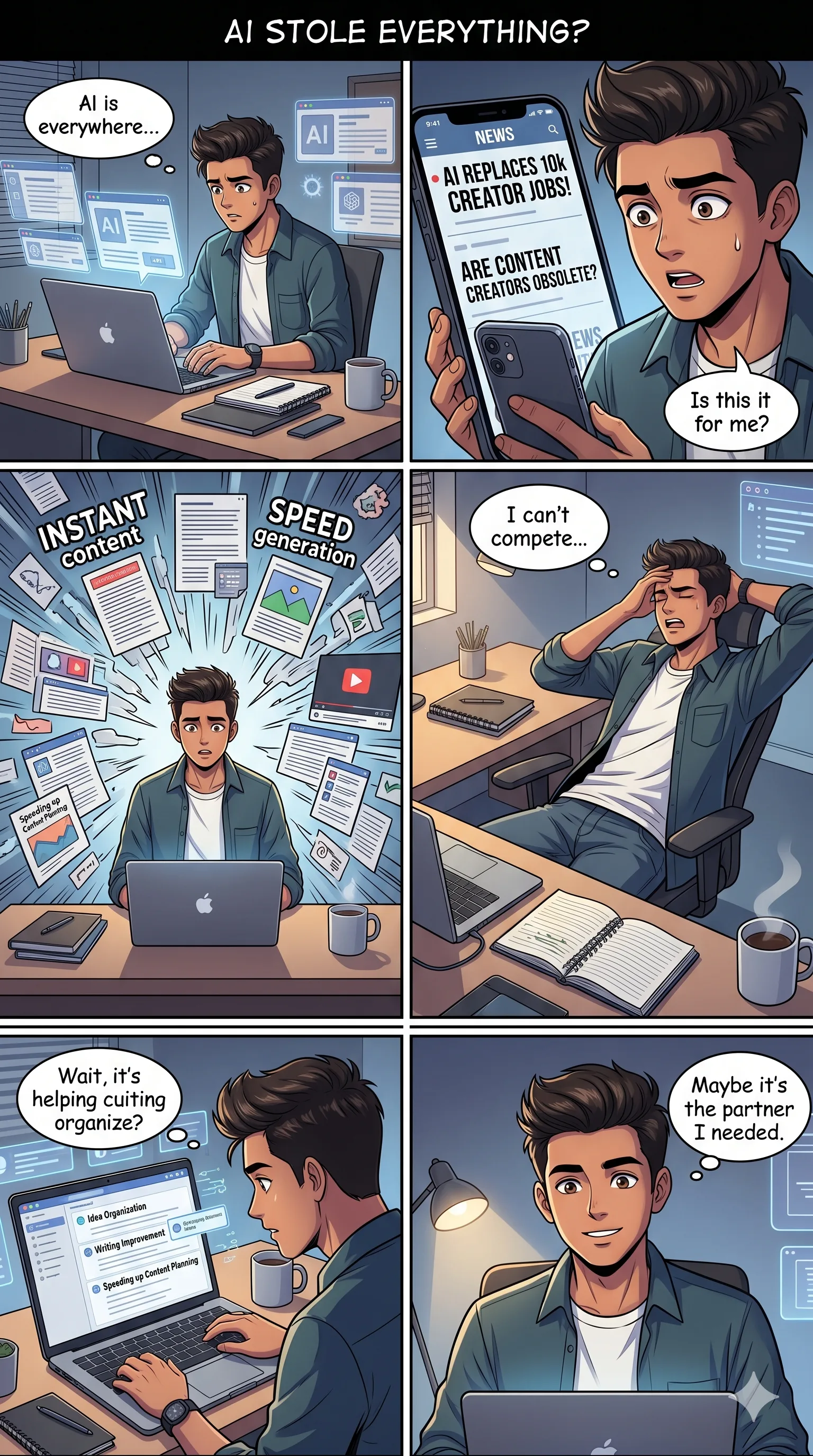
GPT Image 2.0 grabbed the creator's actual character (referencing earlier prompt context), built a coherent visual narrative — AI tools exploding around the character (ChatGPT, Jasper, Notion AI, Canva), then showing job automation anxiety, content planning chaos, and finally resolution — and added a meaningful prop: a book labeled "Plan. Create. Share. Repeat." in the final panel. Every detail reinforced the story.
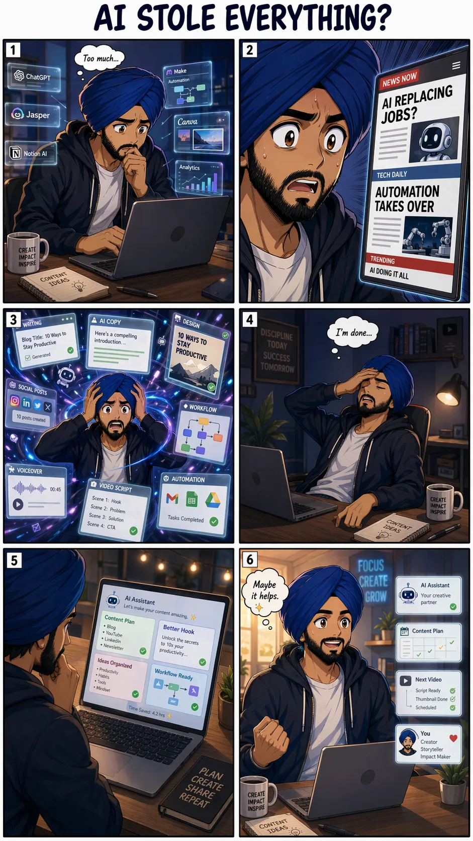
Winner: GPT Image 2.0. Narrative coherence, character continuity across panels, and meaningful prop design all point to GPT Image 2.0's stronger contextual reasoning.
Model Comparison Summary
Dimension | GPT Image 2.0 | Nano Banana 2 |
|---|---|---|
Instruction following | Excellent — precise adherence | Good — occasionally overrides constraints |
Character consistency | Strong across multiple scenes | Moderate — drifts in complex scenes |
Text rendering in images | Excellent — clean, accurate, multilingual | Good — occasional spelling errors in dense layouts |
Object removal / inpainting | Moderate — can over-remove | Strong — preserves scene aesthetics |
Infographic creation | Good — structured and readable | Excellent — richer, more expressive |
Real-time web grounding | Yes — via O-series reasoning + web search | Yes — via Gemini web search |
Brand/ad image creation | Excellent | Good — lacks visual punch |
Multi-slide consistency | Excellent | Moderate — aesthetic drift across slides |
Translation accuracy | Excellent | Good — numerical values can break |
Pricing | Starts at $0.006/image (low) | Available free via Gemini app |
API access | Yes — gpt-image-2 / chatgpt-image-latest | Yes — Gemini API / Vertex AI |
Knowledge cutoff | December 2025 | Real-time via web search |
Max resolution | 4K (API beta) | Multiple aspect ratios, 14 native formats |
Watermarking | Not specified in API | SynthID + C2PA Content Credentials |
Which Model Should You Use?
The answer depends on your workflow:
Choose GPT Image 2.0 if you:
Create character-based content or personal branding visuals
Build social media ads, carousels, or campaigns that need visual consistency across multiple outputs
Need accurate text rendering in images — especially with multilingual or numeric values
Generate sports, news, or event-based graphics with real-time data
Work with ultra-wide banners or complex compositional briefs
Choose Nano Banana 2 if you:
Need to clean up or edit photos (object removal, background swap, inpainting)
Create educational infographics or data visualizations from text/handwritten notes
Want high-quality image generation through Google's ecosystem (Gemini app, Search, Vertex AI)
Need transparent AI content identification via SynthID and C2PA credentials
Work in enterprise pipelines via Vertex AI or integrations with Figma, Adobe, and Notion
For creators running AI-powered content workflows — YouTube thumbnails, social ads, UGC-style campaigns, or brand assets — GPT Image 2.0 is the more reliable daily driver. For product teams handling photo editing, content moderation safe zones, or educational visual design, Nano Banana 2 earns its place.
Final Thoughts
GPT Image 2.0 raised the bar for AI image generation in April 2026. Its O-series reasoning layer makes it the most instruction-accurate model available today — a clear advantage for creators who write detailed, multi-constraint prompts. Nano Banana 2 is no underdog; it outperforms on object removal and infographic design, and its enterprise integrations through Vertex AI and Figma make it the more accessible choice in production pipelines.
If you generate images for content, branding, or social media, test GPT Image 2.0 through ChatGPT or the API. If you're building image editing or educational tools, Nano Banana 2 deserves a serious look — especially given its free availability through the Gemini app.
Frequently Asked Questions

Written by
Raman Singh
Raman Singh is a highly skilled marketing professional who serves as the head of marketing at Copyrocket AI. With years of experience in the field, Raman has developed a deep understanding of all asp
View all postsYour AI Marketing Agents
Are Ready to Work
Stop spending hours on copywriting. Let AI craft high-converting ads, emails, blog posts & social media content in seconds.
Start Creating for FreeNo credit card required. 50+ AI tools included.
Related Articles
 General
NotebookLM For Coders: Turn Docs Into Faster Code
Code work often fails for a simple reason. You do not have the right context at the right time. You read docs in one tab, skim tickets in another tab, and then...
 General
How to Optimize for AI Search in 2026: The Complete Guide
AI search has shifted from experimental feature to primary search method for millions of users. ChatGPT Search, Google AI Overviews, Perplexity, Claude, and Gem...
 General
Claude Opus 4.6 Review: Here's What New!
Claude Opus 4.6 from Anthropic draws attention because teams want an AI model that writes better code, follows instructions, and stays consistent across long se...